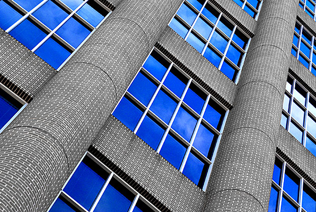
yes, i know, this could've qualified for the windows&doors challenge, but i simply didn't think of it then. :) anyhow, this is a huge office building at tyson's corner, virginia. i was planning on taking a picture of the columns at the entrance and ended up with this instead. just liked the unusual look with the desaturated brick (i initially contemplated just increasing saturation overall, but found this to be more unusual) and how the windows seem to go on forever. alternative title: job security for a window-cleaner. hope this is sufficiently dramatic...
post-processing: cropped, desaturated red (bricks), increased saturation of blue, increased contrast, resized, unsharpen mask.
score prediction: around 5.5
Statistics
Place: 7 out of 94 Avg (all users): 6.9907 Avg (commenters): 7.9524 Avg (participants): 6.9714 Avg (non-participants): 7.0270 Views since voting: 3709 Votes: 107 Comments: 25 Favorites: 17 (view)
I am a purest when it comes to photography. I don't even like to crop my pictures. So when I read your personal comments I was a little disappointed in how much altering of the origional picture you had done. I checked out the origional photo and that one I would not have graded as high. This of course is a personal opinion. So leaving my prejudices out of this I shall comment. I am really big into using the elements of design to create fantastic photographs. Your point of view, perspective, lines, shapes and forms, pattern, reflection,and texture,makes this picture come alive. The rich blues vs the gray stones make for a dramatic contrast. The curvature of the columns gives the picture some depth. Very sharp image and excellent cropping. What I appreciate the most is the fact that you have an eye for the beauty that surrounds us all and then you were able to capture it using the camera. Great job! JOHN GILL
Wow ... thanks everyone - this is my first photo where my lowest vote is a 4! That totally threw off my score prediction :-P Please click here to see the photo straight out of the camera.
Wow, very nice mix of colour with black and white. The composition is very strong. It's pretty much technically perfect, but it's one of those photos where I feel the technique is stronger than the subject choice. On an emotional level it leaves me a bit cold.
Wow, very clear shot with a good perspective subject (might work well for the Rythme challenge too). Color - the blue seems a little too saturated (too dark to be real), but that also may be a result of window tinting (well, it could!). You picked an interesting, but slightly difficult angle to view (still, it works for me). Did you de-staturate the bricks, or were they really this grey? (just asking, not a score issue)
8 Swash
Great Shot! I love the angle that you took this shot from. I really like how the windows are reflecting the blue sky. This is my favorite shot this week (besides my own, of course :-) ).
excellent leading lines, colors and lighting. love the angle although it almost makes me dizzy. the horizontals of the bricks are complementing the verticals of the columns. great reflection of the sky in the windows.
The bright blue and very crisp edges adds a lot to this otherwise boring shot. I can't tell if this building was originally red or not, but your choice of colors really works well. - xertion





 Add photograph to your favorites
 Add photographer to your favorites


 Photographer found comment helpful.


