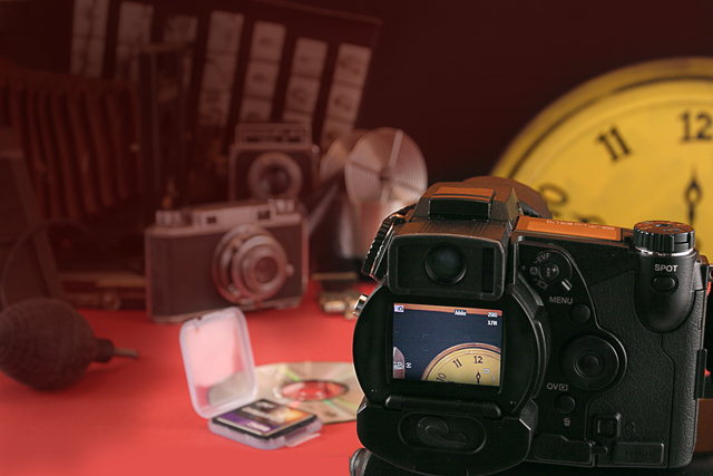
selected camera and levels, selected screen and levels. Selected around camera and clock and laid transparant screen to subdue badkground. Hi pass in overlay mode for sharpenning. Cloned to match background in black and in red for table.
Statistics
Place: 79 out of 155 Avg (all users): 5.3090 Avg (commenters): 5.2857 Avg (participants): 5.1905 Avg (non-participants): 5.4149 Views since voting: 1001 Views during voting: 247 Votes: 178 Comments: 7 Favorites: 0
Interesting approach. The composition is very cluttered - so many different things, and they seem almost haphazardly organised. Light reasonably effective on the digicam, but becomes very weak and flat in the background areas - actually has a feel of the muted tones of an old photograph, which does have an effect. The clock feels forced into the composition (to emphasise meeting the challenge, perhaps?), where something along the lines of a calendar might have been more effective? Your biggest problem in terms of dpc score, however, is certainly the very busy composition, and fairly common idea. Good luck.
Deeper DOF could have made this such a cool image. + another color on the surface everythinig is on.... Its a litle to much with the yellowish clock, red floor and stuff. Wrong things get the attention









 Add photograph to your favorites
 Add photographer to your favorites


 Photographer found comment helpful.


