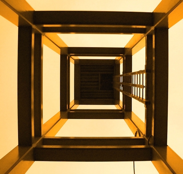
Inside of a modern clock tower on the quay at New Westminster, B.C.
The image was cropped slightly for balance and then rotated 0.5% right. It was then colorized with hue 34 at 97% saturation, the brightness was adjusted +14 and the contrast +3. A little USM completed the processing.
Statistics
Place: 37 out of 94 Avg (all users): 5.9151 Avg (commenters): 7.2500 Avg (participants): 5.8451 Avg (non-participants): 6.0571 Views since voting: 1200 Votes: 106 Comments: 10 Favorites: 0
There are some very positive points to this image. The perspective, pattern, point of view, shapes and fibrant colors make for a quality photograph. What distracts me and why I graded it a little lower than your final score was the large dark area in the mindle of the picture. I feel that area dominates the picture and detracts from all the positive things going on in the rest of your photograph. John Gill
Strong lines lead the eye up--one almost feels vertigo!--good colours -strong graphics this is symetrical without being boring using the staircase as a counterpoint
This is cool, the corners have this odd optical illusion type effect. I don't really like the colours though. Yellow, orange and brown! A little work on the hue could have brought out the red tones more, maybe.
Oooh, yes, I just tried it, and if you turn the hue towards the red end, it turns a really lovely deep orange with darker browns.
eek! I feel like I am looking down! Either way good perspective.. the leading lines in brass/yellow are in nice contrast to the darker tones. The lighting must have been poor.... I can see some loss of quality in the darker areas.






 Add photograph to your favorites
 Add photographer to your favorites


 Photographer found comment helpful.


