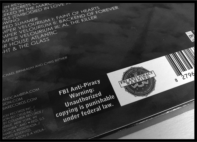
They are starting to put this warning on the back of new cds. Personally... I dont see what good its going to do, but whatever makes them feel better.. lol.
Sharpend, adjusted levels and contrast, desaturated, and slight crop.
Statistics
Place: 66 out of 149 Avg (all users): 5.0278 Avg (commenters): 5.3333 Avg (participants): 4.9512 Avg (non-participants): 5.0583 Views since voting: 968 Views during voting: 396 Votes: 288 Comments: 7 Favorites: 0
and I heard on th news today that the MPAA is trying to get a law passed REQUIRING viewers to watch the commercials and previews on DVDs! Aaargh!
...oh - I like the concept and the shot is well cropped and decent lighting. Good job.
interesting take on the challenge. would probably be a stronger entry if angled and cropped to accentuate the subject (when holding my hand up, the bottom half of the image looks pretty good, by itself.).
If the track list were just a bit soft in comparison to the warning label, they would completely relinquish all attention. As it is, they draw it somewhat.







 Add photograph to your favorites
 Add photographer to your favorites


