Excellent work, I like how your eye is drawn and you just want to go turn the corner to see what's there. The trees in the background make it even more interesting in my opinion, and give more perspective. Well done. 10 -Annida
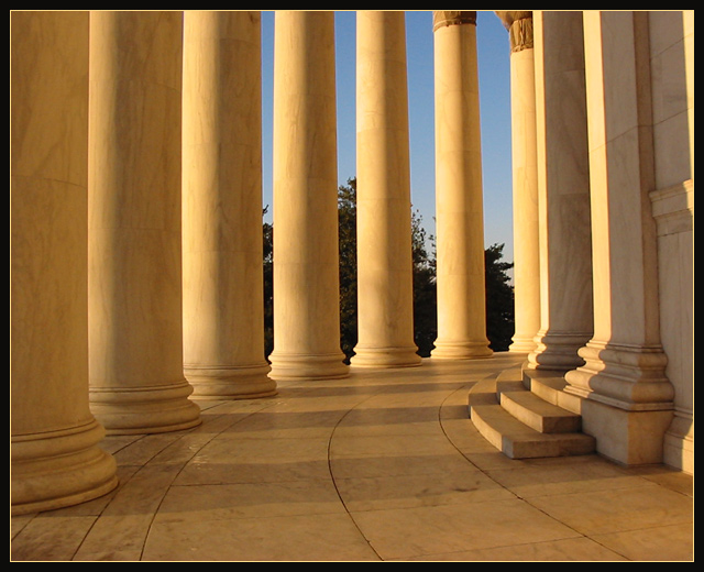
Neat, but the composition doesn't quite seem right to me. It feels too upright with a vague curve off into the distance on the left. If you'd gotten a better angle so you can just see pillars sweeping off into the distance, and cut out the steps and wall on the right, it might have had more impact.
I like this shot. The composition placement seems very good, and the curve of the ground leads the eye well. I think however it could do with a sharpen in a graphics editing program, because to me it looks a bit blurred. Also, the columns seem to be tilting to the left which is a little distracting. 7
This is gorgeous! How did you ever get sunrise/sunset type tones in the pillars with such a nice blue sky outside? Symmetry, ... can't say anymore. It renders me speechless.
very nice shot. seems to have a little tilt in it mabe a few degrees to the clockwise would have helped this. colors are nice but a polorizing filter might have brought out the sky a little more. well done. high scores!
edge of the jefferson memorial at magic hour, right? you could make your own postcards. i think your columns are at like 89 or 91 degree angle, almost but not quite vertical. noticeable because your rectangle's a game of lines.
man what a nice exposure, just enough sweet gold light, saturates just right.
borders don't really do anything for me, but everybody else is using them,
so after this week you won't hear any more moaning about it. go for what you know.
Wow, beautiful colours and composition. I like the way it flows around the corner on the right. Great eye. Jacko. 9 The overall picture seems to missing a bit of focus.





 Round
Round Add photograph to your favorites
 Add photographer to your favorites


 Photographer found comment helpful.


