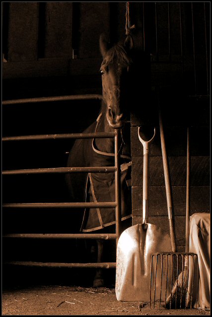
I am struck first with the choice of subject, the horse or the tools, as I consider these, I note that the rope above the horse's ear appears like a noose almost holding up the horse's head. This has become too distracting to me. I like the choice of desaturation and color cast as it ages the image. The varied elements are in good focus or shadowed well in their own place, but the elements vying for my attention challenge the whole as separate things that dont want to add up.
Very good idea, love the tones and the lighting. I think the what would make this a winning photo would be a slightly different composition. The tools are perfect for the theme, but the covered tool is a distraction; If you could have arranged them a bit on the wall, and then put the horse more in the sweet spot on the left third line, with the tools spread along the bottom from center to right, I think it might have been more effective. Also, maybe instead of the shovel, which has a hot spot, a harness, or other horse paraphanalia.hanging there. Or maybe stepping left and shooting from an angle to achieve the similar composition. Just my own perceptions.
nice lighting, and composition. there's something about this composition that i like. maybe it's the linearity of everything ( lines of gate, tools, and even the horses head is kind of long and straight)
This is cool. I almost didn't see the horse. How would this look with either A) the horse's head more center (horizontally, not vertically), or B) lots more space on the left side so the main subjects are way off-center? I like the duotone look here.






 Add photograph to your favorites
 Add photographer to your favorites

 Photographer found comment helpful.


