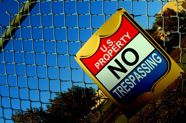
Like the skewed angle, makes for a more interesting shot of a boring sign. Although, the sign is very colorful. I like the way the top of the fence cuts the corner too.
I like the use of the angle here.... makes it considerably more interesting than it would have otherwise been. The over saturation makes the sign look great but the sky is much tooo blue in the top left.
Yeah, this one's great. Very clear colours, a simple message with an ironic comment in the title. I don't know why, but the rotation's nice, too. Perhaps, sometime, you can teach me why.
I guess I can finally handle out a 10. Well done.
i know someone who used to have one of those signs hanging in their bedroom...he thought it was really cool...can't remember his name (not that it matters, that was a long time ago, when signs didn't seem to carry as much authority as they do today). nice shot, like the angle. good luck!
Great angle, it gives a dizzying effect which works well with the concept, but I would crop this a little tighter. It seems to be fading off the frame due to the shadow. That takes away from the imposing image the artist was trying to convey, especially since the title makes a dare. I would also shoot the shot from below even more. Let the sign tower over the viewer.






 Add photograph to your favorites
 Add photographer to your favorites

 Photographer found comment helpful.


