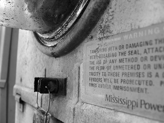
this is one of the more interesting interpretations of the challenge. i think it would be much more powerful with a deeper depth of field, as well as if you'd shifted the focus a little more towards the sign. good luck!
Very nice textures, great depth of field. You met the challenge, too. I feel a tighter crop from the left would have been better. Cropping a bit off the right might have made the words PROSECUTED and IMPRISONMENT come put better.
Interesting point of view. I like the gritty realism of the photo. I would like a more determined focal point so that the message would come across more powerfully (get it- sorry, couldn't help myself.) Very interesting contrast of line and curve.





 Add photograph to your favorites
 Add photographer to your favorites


 Photographer found comment helpful.


