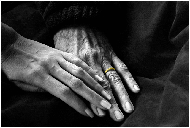
This is simply lovely. The single saturation of the gold ring is really nice although I'd like it equally as well if all black and white. The texture is excellent. It evokes a sweet nostalgia. Bravo!
I really like this shot. I haven't seen it in color yet, but I can imagine that it definitely is more appropriate in b/w. I agree that the ring distracts from the overall image.
Using B&W here intensifies the emotional impact. Not too keen on the gold ring though :(
You are right about the sweater muckpond. I might not have noticed that if I hadn't read your post.
i love this shot. it really tells a story and gives some emotion. i'm not a big fan of selective desaturation -- here i think this image is powerful enough without the need to draw the user to the ring (i think the ring is only pertinent if this were a shot of a couple or if there were two rings to work with).
the color and tones are great. the dark sweater sleeve is SO dark that it leaves a little bit of a hole in the shot, but it's nothing that can't be corrected just a tad. :)
This is such a beautiful study, very intimate and full of emotion. I love the high contrast black and white - it works well to really show the textures in the younger and older skin and I like the way the lighting really brings out every contour. I am not really sure about the large empty area to the right - it doesn't strike me as an image that benefits from that negative space. I'm also not keen on the selective desaturation here as it puts the focus on the ring rather than the relationship between the owners of the two hands (since it's fairly clear the ring isn't about the bond between these two individuals).
Excellant example of how Black & White photography with the right lighting can portray emotion so well. If I had been voting in this challenge, I would of certainly given this a 10.
Oh my! I am so thrilled with the commenters' responses to this shot. My mom tirelessly posed for shots and she was thrilled to hear your comments.
To all of you who left such touching comments - we read them together and she was warmed by them... many thanks.
The gold ring was an artistic decision that some liked/others didn't but I'm glad I tried it. Oddly the composition suffered from not having some element to balance the off-center hands.
This is the first time my photography has such a personal and emotional edge to it -- thanks to the many who responded to the image.
this is lovely but I don't like the gold ring. The saturation gives it emhasis and I don't see how that matters in this competition of time passing--the hands together handle that nicely.
Nice photo, I owuld crop it tighter on the top and right side to focus more on the hands and elminate the empty space . The selective desat leaving only the ring gold is a cool feature, but in this case distract since rings and marriage are not the topic.
Lovely shot, nice idea. Get the point across and envokes emotion. The only thing I didn't care for was the coloring of the wedding ring, it doesn't look real. Still bumping to an 8.
Good use of emotion, very touching. Great composition and setup. Only thing I might want to see different is the ring. Maybe if it was left b/w the focus would have been only on the connection between the Mom and daughter. But then again I'm nit-picking. Great job.
This image hit me right between the eyes. These two hands truly look like the past and present versions of the same hand, or of mother and daughter. Being adopted (I have often wondered "whose" hands I have, etc.) and having gone through some of my own memories for this challenge, this "evidence" of the continuance of life, and possibly mother/daughter, really gave this work a lot of meaning for me. Well done, and great lighting and composition also.
Very nice--I would like it better if it were all in B&W. The ring distracts. Also, maybe the negative space doesn't work well here because the background is so "light" (if it were pitch black area, then yes...)
The tones are nice, the composition would probably be better if the hands were centered though (in this case). I like the ring standing out, but not sure it shows the point of the theme. The lighting is nice too!
Good idea and great execution. Normally I think selective desat is a bit cheezy although I have often used it myself but this is very tastefully done and doesn´t grab your attention but really makes the image work. Also love the lighting and tones in this image. First 10 I give this challenge.






 Add photograph to your favorites
 Add photographer to your favorites

 Photographer found comment helpful.


