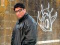
I like this idea. The open space at the bottom of the photo is distracitng. I would like to see you pull in tighter, and swing around more to full front, not square on full but to give the image a more solid feel. I think you should either square it up a bit, or completely come in from the side with the words MY AUTHORITY filling the frame and every other word softly and fading away.
i like the lighting and colors of your image. the one thing that would have really bumped it up would have been a deeper dof and absolutely razor-sharp focus. all the same, i'll score it a 6 and wish you the best of luck.
[as an aside, not that this has anything to with scoring, but all caps in the title are a little hard on the eyes, almost like visual shouting.]






 Add photograph to your favorites
 Add photographer to your favorites


 Photographer found comment helpful.


