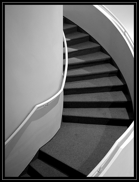
This is a spiral staircase located in the local art museum... This particular scene caught my eye because of the light and patterns. The subject of this photo is not as much a staircase as it is a study of light, contrast, and patterns.
Statistics
Place: 25 out of 94 Avg (all users): 6.3333 Avg (commenters): 7.7143 Avg (participants): 6.0735 Avg (non-participants): 6.8108 Views since voting: 1813 Votes: 105 Comments: 16 Favorites: 4 (view)
Well John, another fine photo from you here. There's not much for me to say here except I think the right side was cropped too much. Even if it wasn't as much the subject I would have liked to see the edge of the staircase. Why? Because when my eyes follow the railing it just stopped at the border. It might be more visually amusing to follow the rail up with your eyes. I hope that made sense.
I really like the use of B&W here and the contrast as well. I wish there was more I could add but this is a very good shot that needs little improvement. Look forward to seeing your photos in future challenges. If you have any questions feel free to drop me an e-mail.
Very graceful curves. I think cropping it at the landing so that the "curve" is not interrupted, and making it extend slightly right would have looked really nice to.
This is beautiful in black and white. Nice job! I love the shadows leading your eyes up the stairs. Excellent use of composition, leading lines, and great perspective. Perfect -10- Talya
I like this , but I think the design elements would be stronger if the right hand rail hadn't been amputated. Then you'd have 3 elegant curves, the left rail, the carpet/ stairs and the right wal/ railing, all working in harmony to lead you through the scene. The tonal range is okay, the lighting is interesting, but that interuption bothers me and my eye. If those elements were more in harmony this would be a much stronger, very graphical design. What would be 3 major tonal areas are also divided up into 5, with triangles in the lower right and upper right that are competing not harmonising with the scene. The steps give just enough interest and tonal range to stop this eing boring. A good effort but needs some thought on the composition and the visual weight of shapes and relationships.
I think this composition is very good. Perhaps I would have liked to see the right part of the stairs too. But it is not THAT important. Great focus, contrast and perfect in b&w. Well done and good luck!








 Add photograph to your favorites
 Add photographer to your favorites


