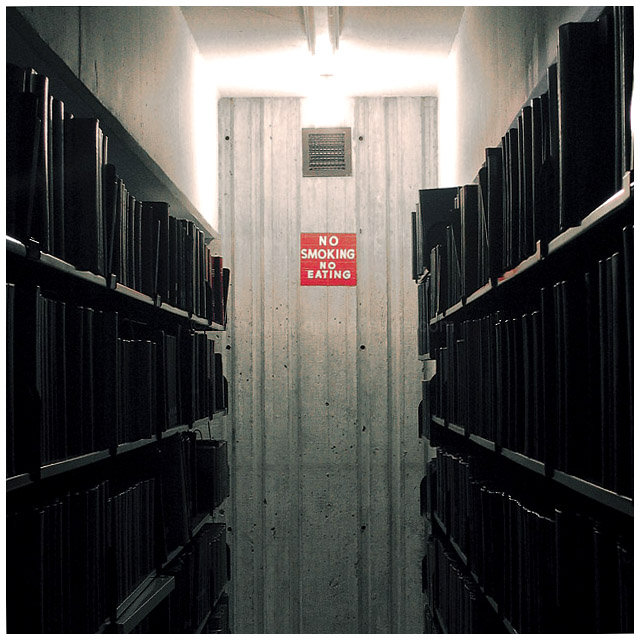
Partially desaturated almost everything but the red channel, then did levels then went back to hue/sat then back to levels etc to get the final result to be like this.
The shot was taken in one of my university's libraries.
Statistics
Place: 20 out of 149 Avg (all users): 5.6219 Avg (commenters): 7.3636 Avg (participants): 5.3086 Avg (non-participants): 5.7475 Views since voting: 1016 Views during voting: 392 Votes: 283 Comments: 13 Favorites: 0
Intense shot. The idea that books are pristine, sacred items not to really be touched much if one can help it evokes the idea that perhaps we care for our books better than we care for our children. This is an amazing shot, well framed and perfectly lit. The image speaks volumes (forgive the pun; I couldn't help myself.) The photographer is a master of image as statement.
Neat lines and I love the shadows. I like that it's more than a simple picture of a sign. There's a solid story to it and it's interesting on many levels. I hope it does well.
interesting composition. the lighting is really effective, the way you've allowed the red to really speak while maintaining the muted colors in the shadows. not sure, but wondering if it would have been stronger if the sign wasn't so dead-on?
I like this one. The sole color, red, has great inpact. The composition, balanced and strong. The light is a bit too bright, and while the grain doesn't bother me, it seems over-sharpened in some places.







 Add photograph to your favorites
 Add photographer to your favorites

 Photographer found comment helpful.


