critique club comment
2 weeks in a row critiquing a magnetic9999 photo. this will be tough because it's so good.
Composition
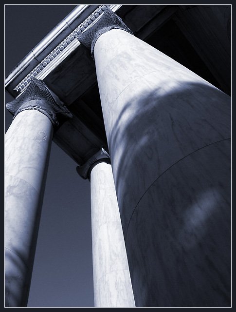
Your choice of angle is very refreshing after seeing how a lot of photos were overdone. It is believable that this could actually be a line of sight for someone looking up at this pillar. The only problem mentioned below and the only problem I really have is the imperfection on the left pillar. As I look at the picture, my eyes conintually get drawn back to that point, which is a shame. The choice of using shadows in your composition is also refreshing and does give a sense of grandeur to the pillars. Excellent job.
Technical
Once again, you have created a technically sound photo. DOF is amazing and sharpness is as good as it gets. The real eye catcher in this photo for me is the choice of duotone. The color creates an infrared feel to it with the dark sky and bright pillars. This was a great choice and created a great effect. Once again excellent job.
Overall
Very visually stunning and pleasing picture. I'm sorry that I can't find much fault for you to correct ;). Keep up the good work
This is an excellent picture! It is one of my two favorites of the challenge. The perspective is great, and the subject is beautiful. Light and shadows are very nice. What I like the most is the color tonality. Good luck in winning the challenge!
Very nice perspective shot! Focus is sharp, good amount of contrasts. Interest - pretty good, it's a dramatic view, I like it! Score bump! from 8 to 9! Swash
Greek columns, I am partial to this being greek :) Your use of low saturation is very clever, and the lighting works. The shadow of the leaves on the column lets you imagine where they are situated, and your eyes are certainly drawn up to the top. Very good image, good DOF. 10 -Annida
Nice perspective here, it makes the columns looks very intimidating. Nice and sharp, and the blue colouring works really well. If only you could spot-edit out that chip on the leftmost column this would be even better. 10
love the tone - wish you could have spot edited the damage up the left column. The rear column seems blocked somehow - would have liked to see this slightly round to the left to break the three columns up- the two triangles at the top don't quite seem to be balanced with the other shapes and lines in the composition








 Add photograph to your favorites
 Add photographer to your favorites


 Photographer found comment helpful.


