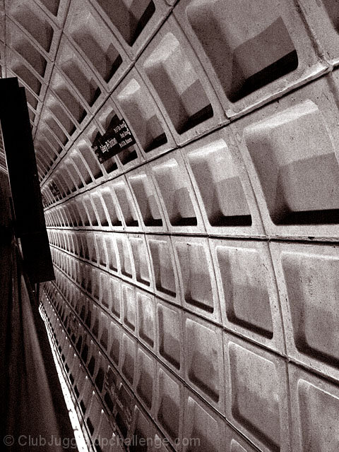
nice use of grain... and it's a very intriguing composition! it really draws you in. i just wish the leading lines lead to something a little more interesting than the black box-y thingie. but otherwise, it's very cool. i love architectural shots. :)
Critique Club,
This sure meets the challenge, and is very interesting as an abstract. The coloring works well for this, but on a personal note, I'm not sure I like the graininess of it.
The tonality is very good, with lots of variable subtlities. The lines are excellent and lead the eyes inward. Repititious shapes are appealing too.
The Metro is a really great place for this challenge. I didn't even think of it (and I'm close by). I like that you used black and white on this (the greenish yellow cast in the Metro shots would not have worked as well). Nice angle, you did great with the lighting, which can be very difficult there. The black rectangle in the upper left is a little distracting to me. Overall a fun shot of a fun place!
Someone recently posted some tips on how to choose which pciture to submit. One tip was something like : If it has writing, maake sure we can read it. It drives humans crazy not to be able to tell what it says- This is going to lose you points in an otherwise stunning picture.
Looks like a Washington, DC subway station. I like how the lines lead the eye in to the photo. I do think the black bar (whatever it is) is kind of distracting though. Sort of cuts the photo short and stop the eye abruptly.
wonderful leading lines. nice even tones. It could face the other way - flipped horizontally, but why must we do every photo the same way? adding distress to the viewer who wants to look from left to right works here.







 Add photograph to your favorites
 Add photographer to your favorites

 Photographer found comment helpful.


