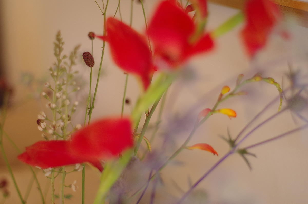
the abstract vs. floral pattern here is really well done, far be it from me to make critical suggestions, but I would like not to see the wood beam or whatever in the upper right.
I like the soft focus style to this, but find that the red of the gladioli(?) a bit too dominant, and because it is a bold colour, a bit splodgy - for me, it may have worked better if it was behind the more delicate stems.








 Add photograph to your favorites
 Add photographer to your favorites

 Photographer found comment helpful.


