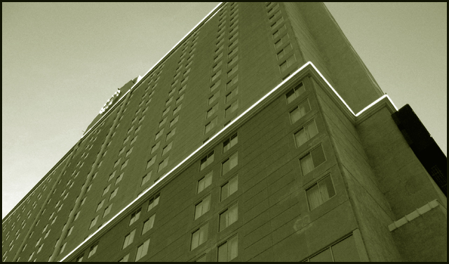
I like the perspective - great use of lines in an unusual orientation. I hope you don't get too abused for a duotone treatment, as I think it definitely fits in the challenge, and works well with this image.
I have seen other duotone shots in this challenge, and this is one of them. Not technically a "palette of grays" but it isn't a color shot either. It's monocrome. Now I'm in a moral dillemma over voting on this image. Ok: "Cool shot, but the duotone will bump you down a bit."
Okay, a duotone and B&W are not the same thing so this is in the wrong challenge, but still an excellent photo. Those luminous cornice-lines are just great. Even better if the very top was as sharp as the rest. 6 (8 if it were B&W).







 Add photograph to your favorites
 Add photographer to your favorites


 Photographer found comment helpful.


