I had a heck of a time getting this done with no shadows in the shot. I don't have alot of fancy equipment to shoot with so I have to create with what I have around the house and with the help of a few people that answered a few question I had.
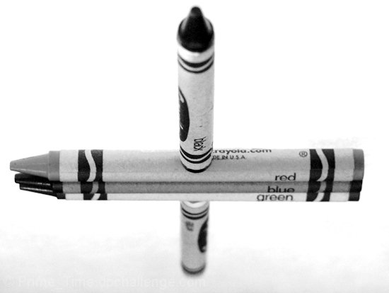
But on with what I did, first taped the red, blue and green crayons togther just on the bottom and added about .032 shims to move them up a bit. Plus this kept them from rolling all over the place. By shimming these three, it made them look more lined up with the black and white crayons. Then layed them on a sheet of glass with standard white printing paper taped to the bottom side of the glass.
Lighting was not real fun either, I used to 250 watt heat lamp lights, which were real cheap to buy. I had to hold both of these at certain angles to get rid of the shadows, set timer and bang...after I don't know how many shots I took till I was happy with it.
I wish the tip of the black crayon was more in focus but had the lights up there and had to just focus on the middle.
Then off to photoshop where I rotated 180 degrees.
Swicthed to grey scale. Levels, just set white point.Curves. Resized and cropped. Saved for web.
Took it to neat image and sharpened and removed noise.
Just wanted to create the illusion of them standing on top of each other.
Statistics
Place: 364 out of 636 Avg (all users): 4.9937 Avg (commenters): 6.4444 Avg (participants): 4.8287 Avg (non-participants): 5.3535 Views since voting: 851 Views during voting: 411 Votes: 315 Comments: 12 Favorites: 0
at first i thought it was a reflection, now i'm just confused! good work - although i'm not sure if you had a specific intention with this particular depth of focus. a little more and we might have seen the name of the bottom crown, or even the details of the entire stack - although it does more of a little feeling of distance/depth to the picture.
Nice portrayal of color, and subtle meaning (black and white with color in between). Image size seems a tad small, but that is nitpicky. Excellent shot.
Very interesting. How did you do it? Hope you added notes so I can see after the challenge ends. I think it would have more umph if it was all in focus but I do understand it would be hard to do with that much space to cover.
what a neat idea! I haven't grasped the creative concept part of photography yet, thanks for the inspiration =) I think I would substitute a yellow crayon for the green one though, since red, blue, and yellow are the three primary colors.
nice illusion, at first I thought this was on an mirror but a closer look convinced me otherwise. very good. the only thing I don't like is the lack of focus on the crayon furthest away (so I could read what colour that is) and the lack of focus on the tip of the black is also annoying. So basically a deeper DOF would be my request. Cheers
Really neat idea. I had to look twice to see that it was not a reflection. If that was what you were going for, you had me fooled (at first). Clever idea, but I would have liked the entire black crayon to be in focus... so more DOF.





 Add photograph to your favorites
 Add photographer to your favorites

 Photographer found comment helpful.


