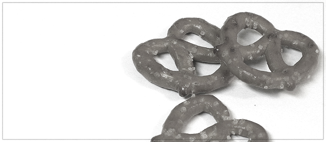
Intestesting and tasty looking. I can almost feel the crispness of them. This is a pleasing image to the eyes, but not particuarly striking for me. (6)
Fun idea, but the values are too limited and huge while space just doesn't work well for me. The cropping of the bottom pretzel is too symetrical; cutting image right in the midline makes it seem contrived rather than random.
What an interesting image - certainly the kind of idea I could see used in stock photography and taken on by some firm in some clever and slick advertising campaign.
Main downsides for me:
1) Composition - the panoramic really doesn't work for me - I like the white space to the left of the pretzels but would prefer to see more of that lower one. Perhaps another third of the height that exists added to the bottom of the frame?
2) With the exception of the background there are no real whites and very few blacks. The tonal range seems very low. That makes it feel a little bland. Boosting contrast helps a little on that front.
I will email you a rough idea of what I mean with composition.
Kavey







 Add photograph to your favorites
 Add photographer to your favorites


 Photographer found comment helpful.


