Greetings from the Critique Club
By Inspzil (who happens to be 3otherboysdad :))
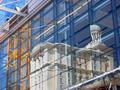
Composition - I like the idea of this pic, it works well for the challenge. Biggest most distracting thing about this picture is the top right corner where the ceiling is showing. I think if the pic could've been taken from a bit higher perspective pointing down that could've been minimized or avoided all together. It isn't terribly distracting, but the first thing I noticed. The "e" being a little cut off I think is less of a distraction. It meets the challenge and is pretty well composed.
Technical - Great job with this photo. It is remarkably clear, well exposed, good DOF with terrific color and very crisp. Not much else to say except that this photo is remarkably well taken.
Overall - Nothing blowing me away, nothing flashy, but an excellent idea and very well executed. The things that I mentioned that could be improved are easily fixable (easy for me to say :) but I don't think would've made your score jump up by leaps and bounds, because this is a good photo regardless. Nice job and keep the good photos coming. Good luck with DPC and your boys. - Inspzil
Very good perspective shot. Challenge well met. Color seem pretty good, but w/o a point of reference, hard to really say other than, I like the colors of this photo. Framing/crop - You got most of it (chopped the beginning e a little bit). Interest - moderate, nothing really draws me in, inviting me to stay and look more. Still, overall this is a very nice photo. 8 Swash






 Add photograph to your favorites
 Add photographer to your favorites


