| Author | Thread |
|
|
02/18/2003 05:24:36 AM |
Greetings from the Critique Club
By Inspzil
First off, that is far and away the longest comment I've ever seen regarding a picture. It will most likely be longer than my critique.
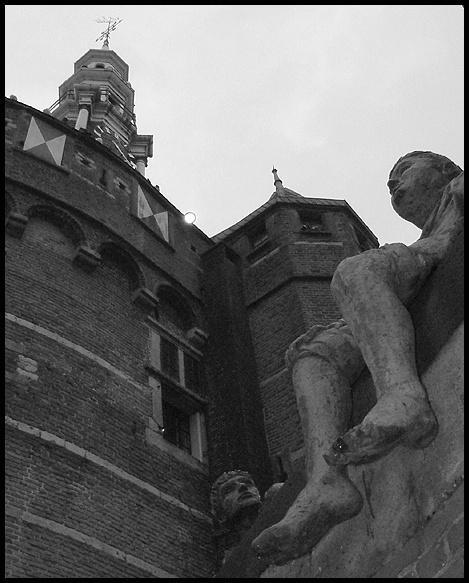
Composition - I think you could've focused solely on the statue and gotten a good image. The statue is my favorite part of this image. Unfortunately I can't stop looking at the white spot on his left foot where it looks like once there was a toe. The spotlight on top of the wall keeps catching my attention now and again. That would've been a nice thing to spot edit out as you said above. The building looks huge, which I'm sure is what you were going for. I like the overall composition and the choice of black and white is very good. I think this might be a little dark for my taste though.
Technical - This does look a little dark but if you lightened it up any I think you might lose the sky. The photo looks pretty clear with good DOF. Fill flash looks like it was a good idea, but that might be where the white spot on the toe came from. Processing - Overall I think you did a very nice job with this one. If there ever was a flash on the spotlight, I can't tell.
Overall - A solid image, but a little dreary with the dark colors and greyscale. By your description of what you did to the shot to make it better I'd say you really did a good job saving a picture. I think the statue should've been a stronger part of this picture. Hats off to your comments, they've proven to be helpful to some degree!! Interesting story - Good luck in upcoming challenges - Bob |
|
 Photographer found comment helpful. Photographer found comment helpful. |
Comments Made During the Challenge  |
|
|
02/16/2003 10:27:58 AM |
|
Very interesting architecture, but the tones in the photo are a bit grey and dismal. It doesn't highlight the textures or the details in the image. |
|
| Photographer found comment helpful. |
|
|
02/14/2003 02:44:39 AM |
|
I like the perspective here but I really think it needs some contrast added in your editing program to really bring out the shadows nicely. 8. |
|
| Photographer found comment helpful. |
|
|
02/13/2003 07:56:25 PM |
|
Very clear shot, but a little dark. Challenge - I'll buy it. Interest level - moderate. My eyes keep being drawn to the light at the top of the wall (Not certain if this is a good thing or not, but I don't think so.....On the other hand, it is kinda out of your control...got a sling shot? 7 Swash |
|
| Photographer found comment helpful. |
|
|
02/13/2003 10:28:54 AM |
|
Great perspective and composition, lighting is dark and the light at the top of the building is distracting. Another time of day would have allowed for better lighting or some creative shadows. |
|
| Photographer found comment helpful. |
|
|
02/11/2003 11:38:56 PM |
|
Very nice use of the challenge. There are a couple hot spots on the foot and the window and at the top. Really like the composition. |
|
| Photographer found comment helpful. |
|
|
02/11/2003 08:39:47 PM |
|
nice composition, a bit too grey.. needs a tad more contrast. overall good. |
|
| Photographer found comment helpful. |
|
|
02/10/2003 08:03:58 PM |
|
i like the shot and the angle, but it appears to be a bit too dark (for me anyway), the statue in the lower center is a bit hard to make out. |
|
| Photographer found comment helpful. |
|
|
02/10/2003 06:49:47 PM |
|
Good job. The inclusion of the statue on the right really makes this shot. Very effective camera angle. Good luck. |
|
| Photographer found comment helpful. |
|
|
02/10/2003 01:27:11 PM |
|
This is a great composition. Good focus and contrast. Perfect in b&w. High score from me. |
|
| Photographer found comment helpful. |
Theme:
Classic /
Light /
Dark
Home -
Challenges -
Community -
League -
Photos -
Cameras -
Lenses -
Learn -
Help -
Terms of Use -
Privacy -
Top ^
DPChallenge, and website content and design, Copyright © 2001-2026 Challenging Technologies, LLC.
All digital photo copyrights belong to the photographers and may not be used without permission.
Current Server Time: 10/11/2026 06:57:01 AM EDT.






 Add photograph to your favorites
 Add photographer to your favorites


