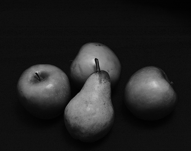
The objects don't really relate to one another, they are just sort of there - well ok, the pear is centered in the middle. They are all the same color in black and white so there isn't much contrast between the objects either. Maybe a light from the side would have added more interesting shadows.
great concept, but I would have liked to see better lighting in this shot. the fruits dont stand out, they just sit there. the arrangement has potential tho. 5
As a suggestion, you could have used to the Channel Mixer in PS to simulate a red filter and that would have made the apples much brighter giving this more contrast. Just a thought.





 Add photograph to your favorites
 Add photographer to your favorites


 Photographer found comment helpful.


