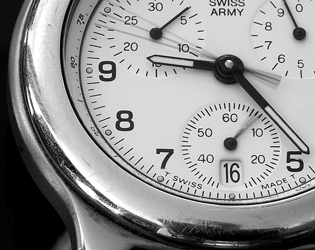
Quite apart from the sharpening artefacts around the numbers and face markings, it is the scratches and disorganised reflections in the face surround that most let this image down for me: they remove from the clean lines, the stylishness of the image, but yet there doesn't seem to be an age factor, a history, a story of use that you're communicating here. The composition of the circle of the face in the frame is strong - not an easy thing to get right - and the positions of the hands and movements of them are clear.
well done. Until this I really hadn't seen any that I liked. Very nice shooting of a shiney object and nice B&W style. The scratches make it look authentic that its old and the moving second hands make it fit the challenge that much more. Well done. <10>
Technically its about as perfect as you could get and I like the tight crop. Should do well as long as the people vote as they should - on an individual basis. However, knowing the way some people vote they may have seen too many clocks/watches and this may suffer. I hope it does not. I wish you luck
Although we all expected the slew of watches/clocks, I really like the choice of the multi-function faces. The crop is great and balanced and the time even lends to the best placement as it cuts off the left 3rd and top 3rd. Great shot.






 Add photograph to your favorites
 Add photographer to your favorites

 Photographer found comment helpful.


