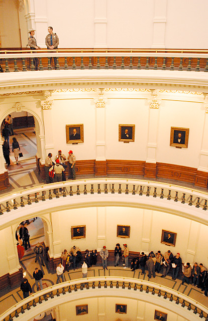
From the perspective, it looks as if you are standing on one of these balconies. That probably means you can support your camera on the edge of the railing. That also means you could have rested your lens on the edge, used a 1/2 second shutter time and used an ISO 200. Which would - to a very large degree - have solved the problems with this image: in all the dark areas, there is a lot of digital noise. Also, the D60 has a nasty tendency to wringing the reds up way too much.
Okay, enough whining about the technical parts; Well seen, great use of your D60, and a fabulous use of the 20mm!
This is cool. It's fun to compare the different groups of people. Unfortunately, they're all so small, I can't really see their body languages as much as I'd like. A tighter crop maybe with just the top 2 levels might have been more effective (if it was possible, and the camera wasn't low end).
Cool shot! Works well with this challenge. Color - very good. Framing - appealing. Focus - seems pretty good, but the ppl are kinda far away to be really, really certain. Overall a very nice shot. 9 Swash
It is interesting that the three different levels have such different activity on them. Gives the impression of three different times as the building is so symmetrical, and the portraits on the wall so similar. Could almost be morning, noon and night. LOL. Too cool.
Focus could be sharper.. but I really like the image.
This is awesome, I really like the different folks on the different levels. The title is right on too. It seems just a wee bit soft on focus but that may have been available light.
nice shot. well done. lighting is good cropping is good. subject is good.
tell me...do you hang out at the state house a lot there in texas or is it just me?
P.S. like the two donut eating troopers at the top skipping out on work!
Wow. That is neat. I really like the curves. The detail is wonderful. You can see details on each little caracter. Good luck. Very visually appealing. Jacko 10
The perspective and symmetry of this image work very well together. I believe that one of the most fascinating elements of the 'perspective' here is how the people in the shot give perspective to the size of the architecture. I believe that the vertical composition also enhances the 'height' of the building... The only element that appears to be a little strange here is the lighting. There is a strange balance between white and yellow in this shot... - setzler






 Add photograph to your favorites
 Add photographer to your favorites

 Photographer found comment helpful.


