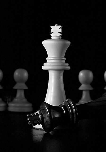
While I certainly don't support the theme in this photo, I felt that the objects used could be used effectively to represent a repression which has lasted for centuries.
Statistics
Place: 114 out of 636 Avg (all users): 5.7577 Avg (commenters): 7.3000 Avg (participants): 5.6210 Avg (non-participants): 6.0374 Views since voting: 1012 Views during voting: 404 Votes: 326 Comments: 10 Favorites: 1 (view)
looks like a violent chess match. maybe i'm wrong but it seems _slightly_ tilted down and to the left - might have benefited from fixing this 'horizon' of the pawns heads to be more level. otherwise, great shot.
And white remains. Tones are good on white, but the black piece is missing a bit. Nice idea, and execution. I would have liked other composition, less action on center.
Just too centered on the white king. A good concept and balance of shades (especially with the grey of pawns in the background) and I like the subject.
Very clever idea and well executed with good even lighting. I think you could explore this idea some more, perhaps aligning the pawns in a circle around them, as if they were spectators in a schoolyard fight. (8)
Now this one took me quite some time to judge.
I feel the figures should be more to the left, but I can't tell why. Strange. I'm glad you didn't use a chess board as surface. It would have distracted from the figures. The title fits perfectly, and the feeling of dominance is striking.
I just don't know what to make of the figures in the back. I don't see how they would add to the athmosphere, but they're good to fill the otherwise empty space.
Very nice, 9.
A struggle indeed .. Nice tones, not sure about the thing between the 2 pawns on the left, basic editing can be a bummer but still a worthy 7 good luck






 Add photograph to your favorites
 Add photographer to your favorites


 Photographer found comment helpful.


