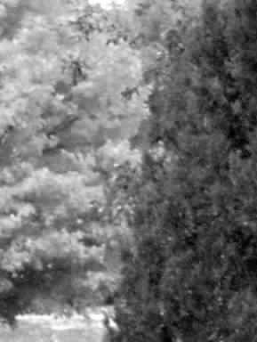
This is a photo taken of the colours of fall as the trees are changing. Though the fall colours are vivid and lovely hen viewed through the black and white t has the ellement of the gray dull winter days that are approaching and at times leave us onging for the more colourful and bright seasons of life.
Statistics
Place: 636 out of 636 Avg (all users): 2.4831 Avg (commenters): 2.6111 Avg (participants): 2.3641 Avg (non-participants): 2.7556 Views since voting: 1718 Views during voting: 362 Votes: 296 Comments: 21 Favorites: 0
Ican't relaly tell what's going on. Seems you've zoomed in too far with digital zoom/had too high an ISO setting/too slow a shutter speed etc as this is very blurred, out of focus and noisy. Don't use digital zoom past 2x or things will look blurry. I like the idea you had now I realise it's trees, but the exectuion of the photo is poor, due to either being a beginner or having a new camera. Keep at it, once you get everything sorted with your camera, try retaking the shot.
I see blurred leaves in multiple layers lit differently. Without sharpness there's not enough form for me to consider. Maybe I'm too technically inclined to like this at all.
Welcome to my new 'worst of show' comment :) Please don't take this personally, but take it as an opportunity to improve. I'm sure there are people here who like this photo and find a lot of artistic merit in it, but I'm not one of them. I dislike this image for several reasons and I will list and discuss each of them here...
1. The image is too small. There is no reason to submit a photo at less than 640 pixels on the long side. Bigger is better in just about every case when viewing photos online. It brings out the detail in the image and gives the viewer more to look at and think about. I would not recommend ever submitting anything at less than 640 pixels. There is no advantage in it that I can think of.
2. The image quality is poor. This photo looks like it is an elargement of a smaller image, or it has been saved with a very high level of jpg compression. If you are not familiar with your editing software and how to get the most out of each image you edit, that should be your first goal in learning digital photography BEFORE you post images online for comment/critique. If there is something in this image worth looking at, the viewer is never going to see it. If your camera is not capable of producing a better quality image than this, you may want to reconsider entering competitions with it. You will be doomed to eternal failure :) The only people who are going to like this image are those who are extremely fond of 'abstract' which leads me into my next dislike...
3. It's a bit too abstract for my taste. The title indicates to me that I'm probalby looking at some trees with colorful leaves. I would never have been able to draw that conclusion without the title, and that is not a good thing when it comes to challenges. This image has no appeal for me at all other than as an abstract. When a photo has no identifiable features, it usually falls into the abstract category. Here at DPChallenge, abstract does not usually do well at all unless the challenge calls for it.
4. This is a black and white challenge, which your photo 'meets'. However, the black and white presentation of this image does not enhance the image at all in my opinion. The black and white view is not creating any impact for me.
In summary:
1. Always submit something at at the maximum size allowed.
2. Learn how to use your editing software to create the best possible image.
3. Avoid abstract at DPChallenge unless the topic specifically calls for it. Most people don't seem to like it.
4. When the challenge is a technique challenge, make sure that your use of the technique creates the primary impact in the photograph.
I hope you find this comment useful in future challenge preparations :)
The smaller dimensions, and extreme softness of this image are making it difficult for me to get into this image... Must be I'm not an impressionist... It is an interesting light /dark frame split on an almost perfect diagonal.
I want more contrast, more focus, perhaps this fuzzyness whould have worked in a color picture, but here it dosent hold you, there is nothing to capture your eyes, they just slide away.
Not quite sure what to make of this photograph, since nothing is in focus. I think I see a pair of trees. Overall, the lack of focus makes this an unacceptable entry. Sorry.
At least one thing needs to be in focus for this to work. The foregroun subject imo. Nevermind focus contrasts, the shades will still come through. This looks like a case of the camera not capturing what the eye beheld. The compostion itself had real potential imo. 4.
i dont like to say lo-fi is bad, and ive seen examples of great lo-fi, this isnt it.. its not gritty enough to be gritty, and its not sharp enough to know what it is, .. its a nice attempt, but needs more bold steps one way or the other...





 Add photograph to your favorites
 Add photographer to your favorites


