Initial thoughts awesome shot, meets the challenge, I like the Sepia
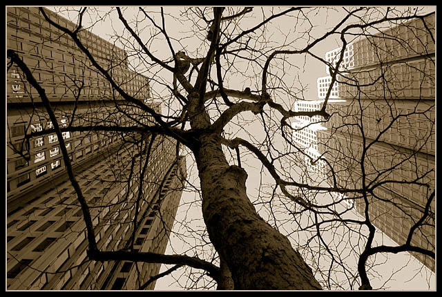
Composition/ Content A great perspective shot, the combination of the trees and buildings is really great. I like the choice of Sepia as I feel it makes you focus more on the tree.
Background About the only thing you could have improved here was to maybe take the sunlight off of the top of the building on the right. I don't think that was possible but I HAD to come up with some improvement right?
Camera Work - Technical Focus seems good and contrast is excellent for the difference in light and shadow you have here. The contrast is what may have really made it a killer shot.
Digital Processing - Technical I like the border, especially the matching color.
Fits The Challenge Definitely fits the challenge well.
My Opinion On The Photo I was so happy to see you get a ribbon this week. It is an awesome shot that had super creativity and an eye for perspective! Great job, and keep up the good work.
I would be happy to talk further about this shot if you would like to contact me.
DougPaz
I really like this angle. It's not the best to show the actual height of the buildings against the tree but it is unique and interesting. I like this photo a lot.
Just as an end note, I think the fact that the inside border is almost the same colour as the sky is a bit distracting, because it makes the branches of the tree appear to just cut off.
nice twist to the "look up the tree" or even the "look up the building' shot. elevates it from cliche. (and I hate that word... but just using it to express myself).
up up, and then finally to the sunlight glinting off the right building. great!
The tree itself has an interesting perspective, but you managed to find 2 other subjects and include in an amazing photosgraph depicting the challenge. The sun is distracting on the one building, the the colors and position are excellent. 10! - xertion
A builing shot and a tree shot combined. Good job! One of my tops of the week. great DOF and focis. The light sepia adds to the drama. The angle works really well here. 9
Lovely. I really like the juxtaposition of the tree and the buildings. It's a bit different take than what I'm used to seeing. I think the sepia coloring works well with it, also. The only thing I find a tiny bit distracting is the lighter tops of the buildings on the right - but perhaps that's just me. Overall I think it's quite good. (8)





 "hey!, my cousin the Redwood is taller than you, guys!"
 Add photograph to your favorites
 Add photographer to your favorites


 Photographer found comment helpful.


