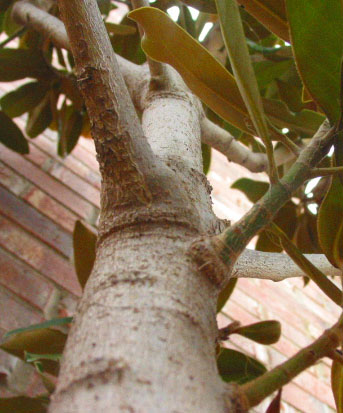
Composition: This is a very centered photo but I think it works in this case. I think if you removed the two leaves near the top center it would have shown more of the tree and more importantly the perspective of the tree. The brick background is a little distracting but you might not have had any other choice.
Technical: The bottom of the tree seems out of focus. Using a wider depth of field would have fixed that. Also the colors seem a little drab. Maybe in your photo editor you could have bumped up the contrast or levels a bit.
Overall: This is a good perspective shot and with a little pre-shot grooming of the tree and a little photo editing would have helped place this shot higher.
I don't get the title. The photo is kind of nice. I like the blurring of the tree trunk bringing my eyes further up towards the branches. Overall, the composition is nice, and the light is decent. The colours are a little washed out.
Focus is a limited DOF, but good in the middle of the photo. The leaves seem to hide much of the perspective part. It doesn't look like a "good" tree to climb. Color seems a tad diminished, but not bad. 6 Swash





 Add photograph to your favorites
 Add photographer to your favorites


