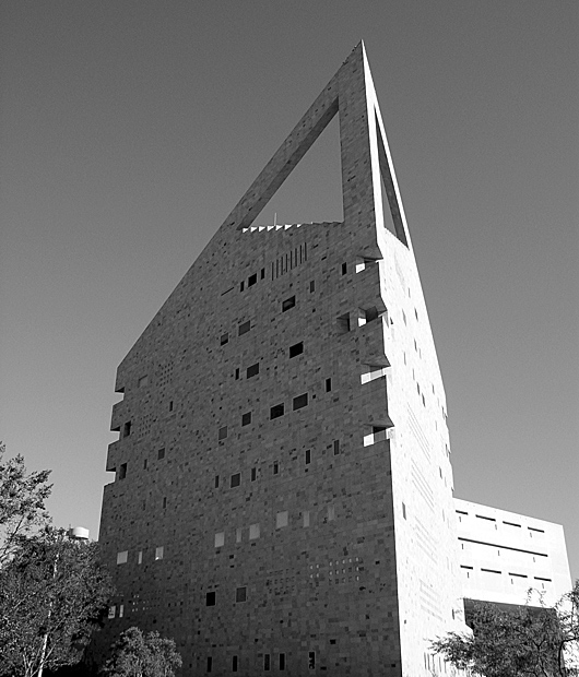
Very interesting subject and I think the B&W fits it well. The two faces of the building having such a discrepancy of lighting helps to emphasize the sharpness of the building's facade.
The image draws the eye upward so I find it incongruent with your title. The photo is washed out, but the light and shadow at the front edges is really quite nice. I think that should be your focal point. Interesting angle, but the image doesn't seem complete. I would try cropping it a variety of ways. I am not sure what would be best; I would want to play with it a bit. I think it is the way the trees are cut in half that gives it an unfinished look.






 Add photograph to your favorites
 Add photographer to your favorites


 Photographer found comment helpful.


