Challenge:Black & White II (Basic Editing I) Camera:Sony DSC-V1 Location: Houston TX Date: Nov 12, 2004 Aperture: 3.2 ISO: 100 Shutter: 1/39 s Date Uploaded: Nov 15, 2004
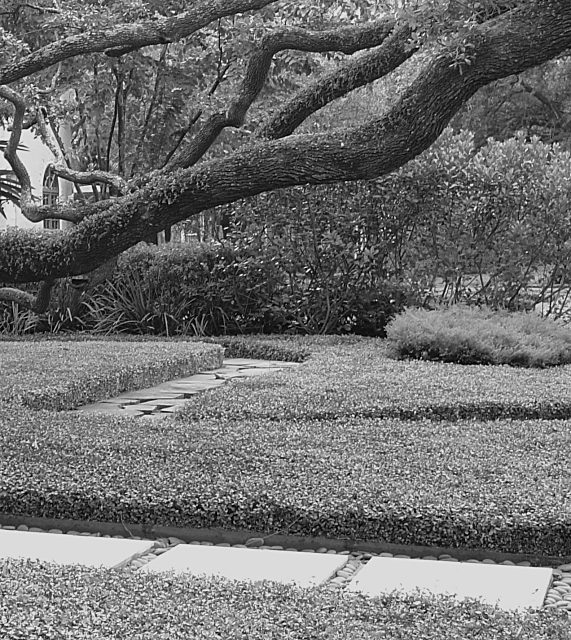
I like the way the limb goes acroos the photo and the winding pathway from front to back. The dof is good. I do think it needs a little more contrast and would have preferred a crop bove the walkway at the bottom. It tends to draw my eye down instead of into the photo.
To me the focus of the image is the tree and having the excess length distracts a little so cropping up past the first path would put the emphasis back on the tree. The tones are all in a very similar range - likely the green - and everything seems to be in focus (instead of having a slightly blurred background), which gives the image a fairly low contrast look. Boosting the contrast a little or playing with the highlight/shadows in curves may help give the image a little more depth. It also looks a little too sharp - making your aperature wider (if possible) so some of the background was more blurred and just having the tree in sharp focus would likely help also.
a little flat, but really interesting subject. like the winding path, and like the tree cutting the image. would love to see this a little more contrasty, specifically with blacker blacks (that's just my preference).





 Add photograph to your favorites
 Add photographer to your favorites


 Photographer found comment helpful.


