Greetings from the Critique Club!
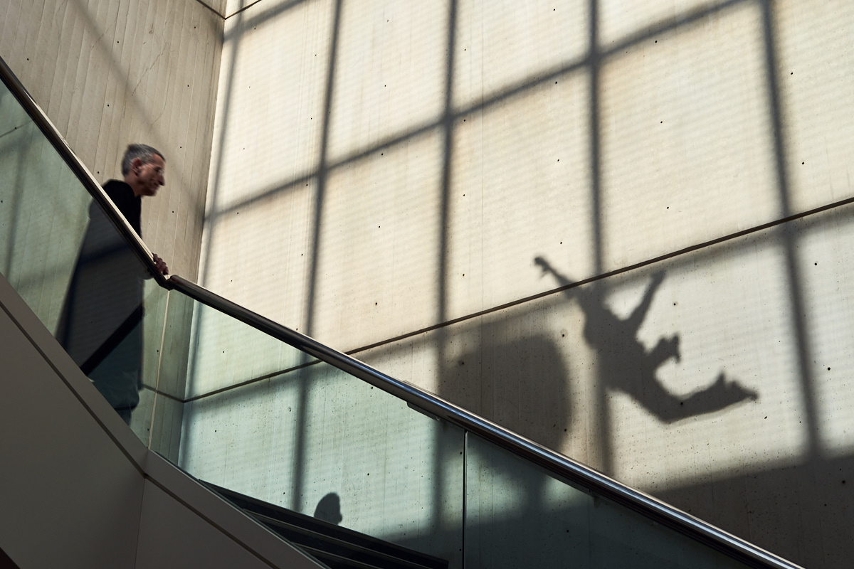
The challenge was a free study so your entry was definitely on point. ;) I love the creativity shown here. My eye was drawn straight to that weird shadow and it definitely looks like a falling person. Nice use of leading lines to bring attention to the shadow. I also like that your live person is looking in the direction of the shadow ... although if someone was falling maybe he'd actually be looking the other way? But I digress. The geometric, repeated patterns bring interest and height to the picture that add to your "falling" concept. The colors and tone convey a touch of sadness and mystery that works well with your theme.
I do wish the man's face was more clear and that he had some sort of emotion showing (shock, sadness). I agree with previous comments regarding a need for context. I have to wonder what that blob the falling person is about to smack into actually is. Of course making the viewer think and look harder at an image is a tricky job. One that you accomplished quite well here. |







 Add photograph to your favorites
 Add photographer to your favorites

 Photographer found comment helpful.


