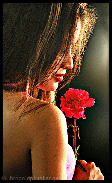
I am not sure about this picture...whether PS work will be allowed or whether it indeed belongs to the "Impressionism" genre. Nonetheless, I worked on it before I read the forum threads about this topic and I decide to give it a go...after all, I spent quite sometime trying the PS filters that would achieve my desired effect.
DQ or not....I have fun doing this.
PS steps:
Sharpened
Curves adjustment
Filter/Distort/Brush Stroke/Angled Stroke
Sharpened again
Dodge tool on background
Sharpened again
Adjust Curves again
Actually, it was a short process...but the experimenting took almost an hour.
Taken during our studio shoot today with the photographic Society that I belong to.
Statistics
Place: 24 out of 39 Avg (all users): 6.0951 Avg (commenters): 6.3750 Avg (participants): 5.4688 Avg (non-participants): 6.1587 Views since voting: 3794 Views during voting: 817 Votes: 347 Comments: 19 Favorites: 7 (view)
This was an image that impressed me and it has more hidden than meets the eye. Yes it lacks the impressionistic technique but it brings its own beauty.
This looks like a lovely photo. I like the intimate feel and directional light. I'm not sure the added texture improves the image any, but I still like the overall effect and composition.
Looks photoshopped and as such doesn't appeal to me. Nice composition and photo in general if you have a version with soft focus i'd like to take a look. Perhaps it would look slightly more appealing flipped hoizontally too.
returning for comments:
A very different approach lacking the impressionistic purity but a such a strong comp that it brings another element of beauty to this challenge. A lovely execution. Bumping up.
I liked the picture very much, but it seems the scratch effects are somewhat understated. Was this done in PS or with a very heavy nylon over the lens?
This was a very difficult challenge to judge. Impressionism is so very subjective.
You have produced an excellent emotive and artful image here. For my own taste (subjective) the image is a little too crisp and/or harsh to fit my personal ideas of "impressionism." In a free study I'd have given a 9 as this overall compostion here is just beautiful in it's communication. Well done. 7.
Good try but I just feel that if there are two components to this photograph (the original image and the camera technique/distortion/filter) then together they don't amount to more than the sum of their individual parts.
don't really like the effect here. not really sure i would enjoy this as a "regular" photo. the lighting seems a little too strong on the arm and face (although it is perfect on the flower). the texture seems somewhat forced, and that takes away from my overall viewing experience.
i think that everything about the compositino and lighting of this pic is excellent. however, i think the high noise look with pointilissm brush was not the best chioce for the image. it sort of makes it look lower in quality without conveying a mood.
8 - Great shot. I really don't like the effect you used on her. There are very few of the texture filters that were used that I think are OK. This one makes her look hairy.
Back again because this is so beautiful. I would be proud to have done this, or have this done of me if I were female. There is no legitimate critique a person could give on this. Truely perfected.





 Add photograph to your favorites
 Add photographer to your favorites

 Photographer found comment helpful.


