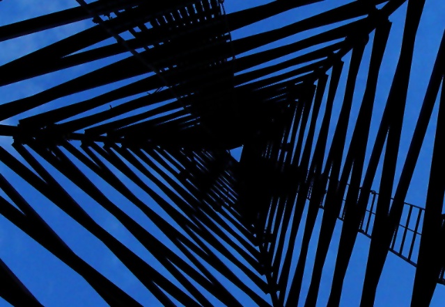
Composition : Certainly an interesting perspective. I would have liked to see this with a few different rotations. My eye really wants to see one of the edges straight (top bottom or a side). But I like the effect you achieved here. I think the lack of an anchoring line might add to the dizzying effect.
Exposure / Lighting : As was pointed out already, it does seem a bit dark. While it works well as is for pure lines and geometry, I think a tad more brightness may have made it a stunning shot.
Focus : Focus is not an issue.
Post Processing : May have benefited from a touch more brightness.
Challenge / Wow : The challenge was certainly met here. A different rotation may (or may not) have helped give greater WoW. I feel strongly that a tad more brightness would have been an improvement.
This is nice... i love architectural designs and the perspective here is excellent. I believe the blue may be a bit oversaturated.. it seems a little uneven.. not sure if that is from a saturation or a level adjustment... excellent shot :) - setzler
Strong composition, but I think it's a bit dark. I would have liked this in black and white, maybe, with high contrast. The blue and black together are a bit confusing to look at.
Strong image! Very good perspective shot. Focus seems sharp. With just two colors, there's not alot I can comment on for color, but the contrast is very good. Interest - gets better with more viewing (really nice patterns) moderate to good. Score upgrade from 7 to 8 (congrats!) Swash
This shot is very interesting. The center of the tower (the top) feels off center, but the contrast of blue and black makes for a great photograph. - xertion







 Add photograph to your favorites
 Add photographer to your favorites


 Photographer found comment helpful.


