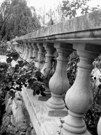
The tones are good. Darks, lights and lots of mid-tones. It does look a little soft and I don't know about the tilt. Seems to be disorienting to me, like it's running away or rejecting the viewer when I would want it to be welcoming.
I do like the contrast, and think the subject has potential. Not sure why, but the photo appears tilted. Definatley busy, and yet the railling draws your eyes back. -5-
I like the way the rail shoots into the back of the picture, giving it a tremendous sense of depth. But, I don't like the way the rail tilts to the left. Still a good shot.







 Add photograph to your favorites
 Add photographer to your favorites


 Photographer found comment helpful.


