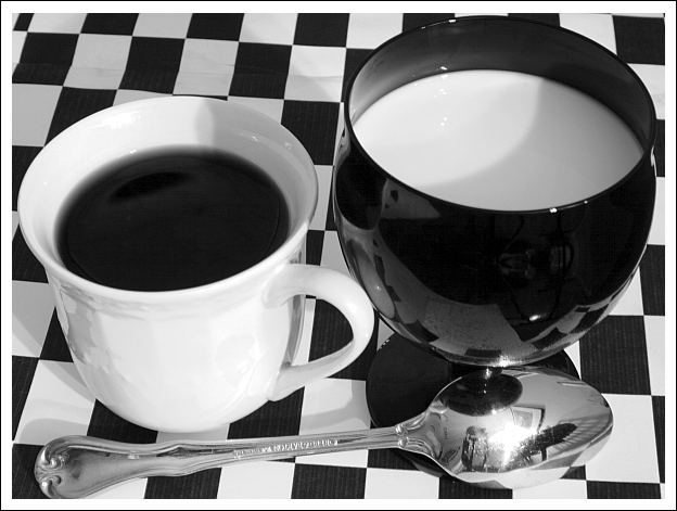
For what it's worth (and I doubt anyone will read this), there was no flash - just a long-ish exposure. Also, the reason the crop is so tight is that my printer ran out of ink, and I therefore ran out of background. If you look in the top left, you can see the edge of the checkerboard pattern.
Nicely done. There are two things that distract slightly, the shadow over the lip of the cups and created in the background and the flash reflection in the spoon. But, great shot over all. 8.
Very nice. I've always wanted to do something like this but haven't. Great contrast. The reflection on the spoon is a little harsh, but c'est la vie! Unlike some people, I welcome response to comments during the challenge and I'm very interested in knowing what light sources you used for this, if you don't mind.
June
Great concept. Only thing I would have done differently is to not crop it so tight. Seeing more of the checkerboard pattern woul dlet the cups blend in more. Definitely a keeper though! I may even have to try something similar myself.
Very great idea, well executed. For me, you could have left the spoon off..it doesn't fit into the black and white theme and it is distracting....still fantastic!
This is cool. Black and White taken literally and with good composition, lighting and balance. I feel the spoon is a distraction however. 9. Good luck!
It's not very good in sense of composition - I think, in particular, that a spoon doesn't look very well laying like that. But it's a first work (by order the works are placed here :) that drew my attention in sense of correspondence to the contest. Milk and coffee. Very good. 8.
It's a classic image. I think having the checkerboard either straight or an obvious exaggerated tilt would be better. As it is now it just looks kinda awkward and makes me tilt my head to manually straighten up the lines myself. The cups look a little squished together and would have likely benefited from a little more negative space around them, ie not such a tight crop. It's a shame you couldnt get two identical cups just in the different white/black. I'm not sure what the round black thing is under the black cup but it stands out as being different from the pattern. I also think it would likely have done better without the spoon as you can see the reflection and what appears to be a flash.
Great idea for this theme - bit down from the technical side: ugly shadows from the flash and lack of black/white squares in the reflection on the black cup. I don't know why you needed the spoon though, it only got overexposed from the flash and showed the rest of the room... Details, details... I'll still give you a 9, great idea...






 Add photograph to your favorites
 Add photographer to your favorites


 Photographer found comment helpful.


