Greetings from the Critiquee Club.
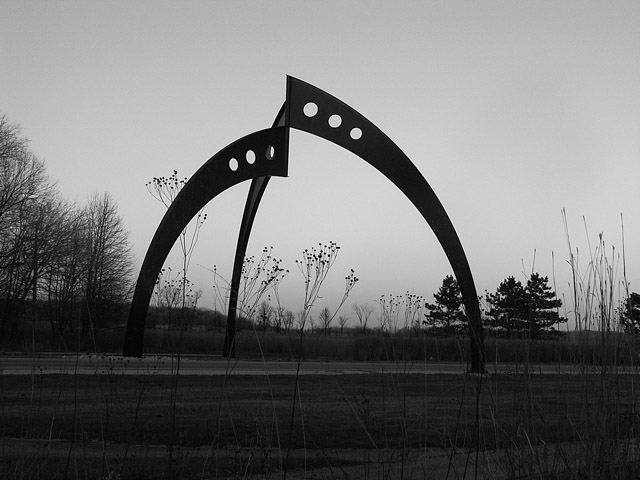
You have a very graphic pattern with some excellent shapes and lines. I'd guess the sculpture itself is what attracted your attention, so let's see what might make the image a bit stronger.
First - since the sculpture is the subject - why not try shooting it as a vertical, thereby eliminating the space on both the left and right side? I'd also trying moving in a bit closer so you could shoot more "up" but still placing the top of the metal close to the top of the frame. The weed patterns under the schulpure don't bother me at all, but the weed that crosses through the left leg and is visible above is a bit distracting.
Another way to improve the image would be to use the full tonal range. For an "old fashioned" black and white - it's always best to have some really deep blacks (which you do) and some relly white whites (which are missing.) The lightest area of the image are pretty gray.
So - try those few things and see if you llike it better. Although it's not the "real thing" done in camera - I did some of the same work in PS. Thanks for sharing youir image.
-Tom-
//www.dpchallenge.com/image.php?IMAGE_ID=124940
|





 Add photograph to your favorites
 Add photographer to your favorites


