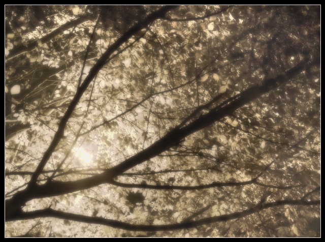
Intersting how many people thought this would look better in colour, as this is in colour.
The shot is taken at night, and the light is a streetlamp. This made for a very monochromatic image. I played around with the hue and the saturation in order to make it less orange tho.
returning for comments:
Now, here you have a beautiful image which you have placed at a great disatvantage. Impressionism was born out the color medium. There were always great pencil and ink renditions in varied styles but not one of them were recovered or regrouped with this movement. It is the color that trumps form in this genre. This being so delicate, I would venture it would scored much higher in its color rendition. Please do not hate my assessment. I realize that one can reproduce any of the giant's of impressionism into black and white prints and while many will look good, they are certainly not well served. Your composition and rendition is certainly above average and I am sure you will finish is a respectable placing, but the color may have placed this right at the very top. Bumping to 7
The black and white of this seems to take something away. What would it look like if you pushed the WB to a Tungsten (BlueCast) or pushed the saturation/hue into another realm that would have given a pastel coloring to it?
not quite sure what i feel here...ok, after looking at this awhile, i think i would prefer it with color. it seems to have potential, but the duotones just don't evoke much emotion for me.
Interesting study in lines, light and textures. Not sure if it really appeals to me, but there's no doubting it's a well taken photo. I don't particularly like it in sepia, and think I would have prefered a colour version. 7





 Add photograph to your favorites
 Add photographer to your favorites


 Photographer found comment helpful.


