Critique Club Comments by Grayce
Hi Justine, I don't see the grain or artifacts, but I didn't see it in my own submission either, and others did, so I guess I'm not much help in that department.
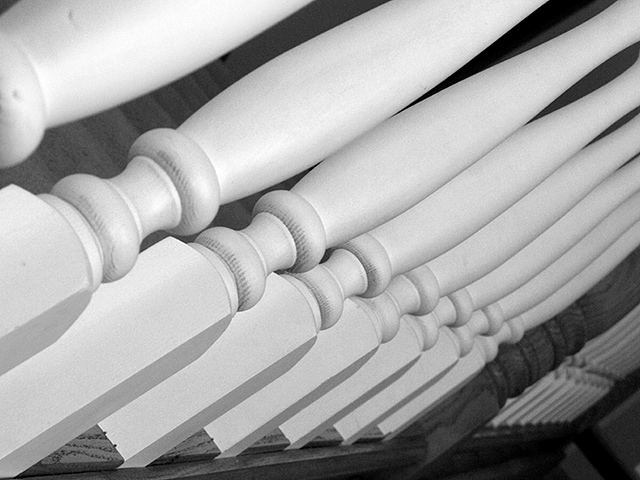
What I like about this is that it is an ordinary, everyday kind of subject, that when examined more closely, as in this image, it highlights the curves and turns.
I like the light and shadows, how the flat part is in shadow. I think a bit more contrast might be nice, but then, the illusive graininess would be highlighted too, I suppose.
This certainly meets the perspective challenge, and the perspective is interesting.
The dof could be improved to satisfy those who want everything in focus. It's all personal taste. It's fine as is for me.
Overall...It's not a compelling image. Most of what you see can be seen in a glance, without inviting deeper study. It would be a good one to play around with it PS just for fun to see what you can come up with. Has potential for a fun abstract...of course not here though...lol
Regards,
This photo doesn't have a lot of tonal depth, ie. overall it seems grey to me. The composition of the spindles is a bit too severely angled. It feels like it directs my eyes up to the top right corner, which isn't a good feature compositionally.
Good use of the challenge topic. I might have liked the first post to be in focus rather than the second.. A little bit of grain noticeable that looks more like artifacts rather than woodgrain.
right point of focus. bonus points for not throwing on a superfluous border. neat thing about this one is i bet folks run up and down the stairs a zillion times without catching this angle, which is why it fits the challenge so well. black and white a good choice.








 Add photograph to your favorites
 Add photographer to your favorites


 Photographer found comment helpful.


