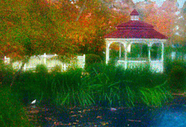
This was created with the help of several lens filters. I added high levels of saturation, Contrast, Gaussian blur, Neatimage and Sharpen along with some dodge and burn to clean-up, enhance and exaggerate the effect.
I used generally acceptable tools, but I used them well beyond acceptable levels. I like the picture and I think it shows impressionism, But I'm not sure if the voters will still consider it a photograph. I enjoyed the challenge and learned a little about the strange effects from combining opposite tools like Neatimage and Gaussian noise. I like old grainy aged looking photographs and I will be able to use what I learned from this challenge in some of my new stuff. (To a much less degree).
Statistics
Place: 32 out of 39 Avg (all users): 5.7947 Avg (commenters): 6.1364 Avg (participants): 4.6875 Avg (non-participants): 5.9094 Views since voting: 987 Views during voting: 682 Votes: 341 Comments: 24 Favorites: 1 (view)
Very clever of you to use noise and saturation to provide your brushstrokes. Good color palette and composition. The image could lean more toward pointillism than impressionism (which could cost you some votes), but a strong entry overall.
This certainly has a painterly quality to it. I don't find 'painterly' necessary to meet the challenge, but this does. The compositon and colors are very well used here.
Challenge link: weak - although you have depicted an Impressionist style.
Image critique: Scene is OK, but it's important to grasp what the challenge is about. This is not photographic impressionism but filtered digital art and you've clearly misunderstood the aim here.
Out-of-challenge appeal: none for me, as the FX are crude and reminiscent of some initial experiments with Photoshop.
Not sure if the noise was intentionally introduced, but it detracts from a magnificent scene. I would rank this higher if the noise was better handled.
Looks photoshopped... I'll come back for a closer look though. Edit: I still think this is photoshop, as such it doesn't hold a whole lot of interest to me. The color noise is just too artificial. I cannot think of anything natural that would give bright cyan noise both on light white, on the fence, etc. I think this is just 'add noise' feature.
When I was thirtheen I had to study impressionism for my school. Beeing Dutch we were made familiar with Van Gogh and that lead to Pissaro, Monet, Manet and Degas. I've seen some paintings in real live and they made a good 'impression' on me.
The saturated colors and pointillism of this reminds me of that. The composition is pretty good as well. It is a wonderful picture.
Did the impressionists use digital noise? ; )
I have to admit that this is looking better than when I voted (+1 on its way!) but overall it still reminds me too much of a very noisy digital image. Otherwise, this is a nice scene to snap, and well composed.
The blue, most of the gazebo, the plants and fence look good. The roof and the trees look to jarring compared to the rest of the scene. I wonder if the photographer used selective sharpening for the effect. Hope it's in your notes.
Too much post editing. This would have looked better with a little blur or shot through milky glass or something. I just don't really care for a picture that is obviously post edited.
there are a lot of things i like about this image, and a lot of things i could like about this image. the post processing is not one of them. i am trying to judge each image as to how it makes me feel as opposed to the mechanics involved either in camera or post-processing. i'm sorry, but this one just feels, to me, that you had to go to far to get the result. if i'm wrong, i'll gladly retract and eat my words.






 Add photograph to your favorites
 Add photographer to your favorites

 Photographer found comment helpful.


