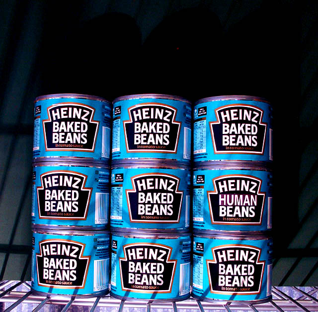
Oh yeah on the pict - lighting great. constrast is awesome - on cans it is comic like - like a warhol soup can. shadows and texture of shelf add a lot. The depth of black at top swallows up the eye a bit too much. Hope that is useful feedback.
Heinz "Human" Beans? Come one. Get real. But then, this is a different take on it. Give you credit for that. I love the color of this and the focus is fantastic. The base is a fantastic idea. This is just a plain old good photo. Even though I don't really feel this is what was intended I like it. Now everyone else is going to stone me. But this is good. Have to take off a little for not having a person but you still get an 8. In other words, it's a 10 photo.
Does not meet the challenge. The word "human" cannot be considered as a "person." Almost missed that. Nice try. Interesting shot otherwise, but a little tilted.
made me laugh once i had seen it .. although think i have seen it before somewhere .. nice pic.
Is it meant to have an off center and skewed appearance to it ?
(good choice of lighting btw)
Love this one! Very Warholian. Crisp and clean. Kinda distracted by the grill at the bottom, but the barred shadows on the cans add something. Couldn't quite stretch the challenge definition to fit though.
Very original concept on the Waldo theme. I think it really does meet the challenge in a metaphoric kinda way. :-) I'm not sure about the light shining from the bottom though. The bars reflecting on the cans is a bit distracting. 8
O.K. I'm missing it...where's waldo? Very good color and focus. OOOhhh, I finally saw the can with the different label. (Sorry, but I'm still not really buying this as waldo!) Background and wire base doesn't "do" anything for me. 6 Swash
I have to admit to not being able to see Waldo at all in this - though I do miss baked beans, human or not. .. are they like the ones with sausages in them, but this time bits of waldo ?
As you could crop how you saw fit, a square crop on this might have worked well ?





 Add photograph to your favorites
 Add photographer to your favorites


 Photographer found comment helpful.


