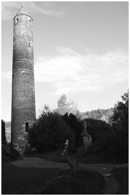
I'd like to see better lighting on the foregrouns statue to create play between it and the background tower. Seems like they would be good together. As it is, the foreground statue is a bit too dark to really latch onto.
Just looks like a scene in a dracula movie I saw once. Cool picture allaround, maybe a little underexposed in the bottomparts, may wanna use a grad ND filter to get a better exposure! well done 8
I wisht ehre was a way for the foreground to be better lit. I realize that exposing for the foreground would have resulted in the sky being blown out. What you may want to invest in is a graduated neutral density filter that holds back the light of skies and allows for the forground to be properly exposed.
Nice picture but it seems you didnt have optimal light conditions when you took it cause the ground ended up to dark and the tower is missing a little contrast for my taste...
A bit more detail in the foreground would have been nice but I understand the high contrast situation you had to work with here. Because of the shape of your subject there is a lot of dead space..the dark foreground and empty area of sky which might hurt in the voting.





 Add photograph to your favorites
 Add photographer to your favorites


