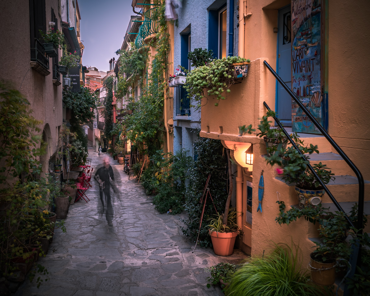
Huge difference when viewing this image on different monitors . Looking so artificially baked on one, so pleasantly French on a different one. The curse of the digital images. They need printing
Bump
An effective combination of context, color, and motion. I really appreciate the restraint in saturation and vibrancy. And the RoT placement of the subject in motion all works to draw attention right to where you want it.
Using the road, or alley, as a thirds line opens up the scene and extends it out of the frame. The moving man, who is well-presented, hits his mark on a vertex. It's a pretty environment, so fitting for a artist. The light is pleasing. An enjoyable image.
good idea but perhaps you needed a much longer exposure to fully get the painters movement more defined I like the place andthink it could be a place of interesting photography 6






 Add photograph to your favorites
 Add photographer to your favorites


 Photographer found comment helpful.


