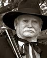
I think that the cropping in the entry photo is much stronger than the full-colour version as it really emphasises the face wonderfully. However, the desaturisation works against you as the head blends into the background quite a bit. Having said that, the strong, blue background rather overpowers the face in the colour version. Desaturisation could work, but on different colours for different reasons.
I picked this up in your thread. Personally I'd prefer for selective colour to be left for advertising. Here, I think leaving the mans face without colour diminshes him as a person and distinguishes him by what he was rewarded with. In a way, it diminshes his achievement to being generic, rather than heroic. However, this works as a photo in that respect, as some people may feel that the veterans are just faceless soldiers. Excellent shot!
I like the use of selective desat here, it really helps sell the achievements. I don't really like how his face sort of blends in a little too much with the background here, but I'm empty of suggestions on how to improve it.. your contrast and lighting seem to be really good. Perhaps just a change of BG (as nice as this one is)
impressive array of medals!nicely composed portrait, but I think the lighting is pretty flat here. The dark detail areas of the uniform are lost and his head gets lost a bit in the background.
The Colonel has been there! He has seen the elephant...let the miserable whiners and professional protesters hang their heads in abject shame. This man personifies all that is great and admirable about our USA military...and if you will open your eyes and minds to see his top row, third from left decoration, you will see why our country is still free and open, and truthfully the envy of the entire world.
Sorry but this photo has been ruined by the selective desaturation. This would have been a lot better either in colour or in black and white or sepia, not in between.
WOW!! Is that four Purple Hearts, Two Bronze Stars, and a Meritorious Service Medal? A very excellent portrait. I might have tried a soft blue background, but its still very well done. Tell the Colonel, Semper Fi.
I don´t think the selective desat is working at all in this image. As a portrait this isn´t horrible at all, but hardly good either, just about average and then the medals draw enough attention as it is without the colours so I just can´t give it anything but a 5.







 Add photograph to your favorites
 Add photographer to your favorites

 Photographer found comment helpful.


