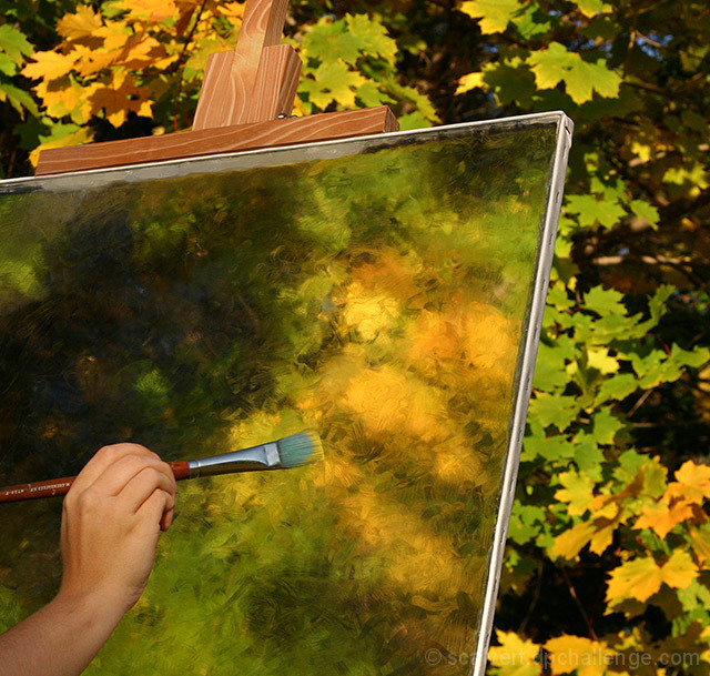
How's THIS for incorporating impressionism into a photograph? No Photoshop filters, no paint, and no added sugar. ;-)
The 'canvas' is a sheet of plexiglass with petroleum jelly smeared on the back to create the brushstrokes. I wrapped white denim around thin strips of cardboard, inserted staples, then used hot glue (still visible) to secure them to the sides of the plexiglass. The 'easel' consists of a few blocks of wood glued to the top of the frame.
The toughest part was finding a decent background. A nice pond with a gazebo and water lilies would have been better. Most of my local landscape is rather depressing and lifeless right now- this was one of the last trees in my area with leaves still on it.
Processing: The typical crop, USM, saturation and levels routine. A little dodging on the arm and brush. I cloned around the edges of the hot glue in spots (and also some tape at the top left) to make them less obvious. Similarly, I cloned just a few spots to break up a tree reflection above the hand.
The biggest modification was hiding a small block of wood visible through the glass under the easel top. Rather than clone it out, I colorized it to roughly match the surrounding area, then cloned in a few spots to make it less obvious. The "paint" on the brush was similar- colorize the bristles, then use the history brush to fade it back.
I suppose I'll lose a few points for not making the entire photo impressionistic, and some people will assume I used a PS filter, but at least I achieved my interpretation of impressionism.
Statistics
Place: 1 out of 39 Avg (all users): 7.3580 Avg (commenters): 8.3036 Avg (participants): 6.4194 Avg (non-participants): 7.4486 Views since voting: 18865 Views during voting: 919 Votes: 352 Comments: 116 Favorites: 120 (view)
Scalvert, you sly soul. You, too, are a master. I had visited DPChallenge many times with my students to help them learn to critique works of art, to hopefully see beyond the initial image, before I became a member. I remember many of these pieces. What a talent you are!
I have to admit, normally I'm not a big fan of Impressionism but this one is just fantastic! I figured out how you did it when I saw it but it still was just so perfect! The only thing that threw me was the easel backing but that was cleared up in the explaination. Fantastic job, wonderful work and I just love it!
Congratulations! Like this really surprised me/us!!! We knew it was a winner, didn't we?!!!
We loved all the well deserved, great comments, too...especially Joanns..we've known this to be true for a looooong time...and Bren B's! Anxiously awaiting the next visual treat! J
I loved this shot from the moment I saw it, and immediately added it to my favorites. Coming back and seeing how you did it is even more creative and awesome than I ever thought.
WoW Shannon! Congratulations on your first Blue!! Another brilliant idea (first ingredient to successful ribbon wins) well executed and planned! Your creativity is endless! Great Work!
Congrats Shannon.
As being one of the more ingeneous takes in this challenge, the Blue was well-deserved. Thanks for the comments regarding how this was done.
Woo Hoo! A Blue for You!
I have to say in my attempt to vote all the photos and challenges you fooled me! I tried to pride myself by voting all on entries in the challenges and not just the minimum 20%. But from now on I will have to take more time in examining the photos even if it means not voting on all entries. This is the sad part of having so many entries and so many challenges to vote on and not enough time. I get the feeling that alot of Photgraphers are going to have some great shots slip through the cracks because of this present condition.
Once in a while there is one picture that stands out as being totally unique, original and captivating. There was no doubt that yours was the one in this challenge. Congratulations.
Once again proving the old adage - "When in doubt, use petroleum jelly." Congrats, Shannon. I never would have thought of this and am amazed that you accomplished the goal of such a demanding challenge in camera. Really great job!
when i 1st saw it i somehow knew what u did but i thought it was that an actual peace glass with that texture oh well it was a good gess and u are very creative for having thought of the whole thing...(but i ramble)
I gave this a 6, not realizing what you had done... this is one of those instances that I wish we could read the process during voting, because I would love to bump my vote to a 10 for your inventiveness. I just thought you took a picture of someone painting! This definitely deserved the blue. Incredible.
This has got to be the best IMHO! Love how you managed to combine the impressionistic and the photographic without losing the integrity of either! Had to come back to this shot and bump it up (which I hardly ever do. Sometimes down but hardly ever up.) Oh and I just realized another reason I like it.... It kinda has a Norman Rockwell feel to it! Kudos and crossing fingers on a ribbon for this one!
TC
returning for comments:
A unique approach to both worlds. Here you have made a sandwich of an impressionism sliver between two slices of classical realism. Good work. Bumping up. And rebumping.
Anxious to see how this was done...can't tell if you actually are paintiung on the surface or if it is just the texture of the glass. Beautiful effect.
Image critique: well conceived and executed. Photo does look a bit 'ordinary' though - can't quite put my finger on it. Technically good shot and you've thought it through well.
Out-of-challenge appeal: I'm sure they'll be plenty, but I don't need to come back to this one really.
Returning for comments.
This is one of the most ingeneous takes on the challenge.
Great composition & detail. I will be curiuos if this was done specifically for the challenge or if it is something regularly done by someone you know.
Well Done & bumping up another notch ((8))
Clever idea. I like the colors, and the angles made by the edge of the canvas. I'm not sure I like that the top of the easel and the end of the paintbrush run off the edge of the photograph, but you may have tried having them show completely and it didn't look as good. :) Also in the realm of things I'm not sure about..the real leaves are a little bit out of focus, and I can't decide if that works because it implies that the artist is painting what he or she literally sees, or if it doesn't work because the artist should be seeing the world clearly and then transforming that vision into the blurred colors of the painting.
Those are just ideas and musings...I think the photograph is lovely as it is, and would be equally lovely if those things were changed. The two bits that actually distract me from the picture are the grey stripe at the top of the canvas, and the fact that the brush looks like it's hovering next to the canvas instead of touching it. It might look better if the bristles were bent a little, to capture the brush stroke as it's happening.
The painting is fantastic. I'd like to see it in full after the challenge.
I'm not over keen on the photo though - technically it is good, but nothing else really appeals to me.
Think is really well done If you really painted this which I think you did you have an awesome talent
Detail colour Idea and focus spot on One of the winners in my view
The colors are very pretty, I think the focus should have been on the leaves in the background. I think it would have made the eyes go towards the middle and not to the hand with the brush.
Good composition. This photo combines the artist's impression of the foilage with the real foilage. The hand,brush and aeasel placement leads your eye into the photo.
Such a difficult challenge to judge with "impressionism" being such a subjective thing.
In general, I just love this piece. It has an obtuse obviousness about being evidentally an attempt to define impressionism itself through the use of same.
There is something about the photo-clarity of the easil and artist's hand breaking the contrast of mother nature vs. the human, which I find somehow unsettling.
So hard to rate amonst the other great submissions! 9. Good luck!
I think this is brilliant. Considering the caliber of your competition, you should be really proud for coming up with an idea that puts of most of theirs to questionable shame. My favorite of this challenge by a long shot. 10
great shot, very original idea, can't tell if the painter is painting with that effect or if it was done in photoshop...that is why I am giving you an 8
Great work! What an imaginative depiction of Impressionism! I really hope this wins...
I only wish that the paintbrush and hand were lit/positioned slightly differently, but that won't stop me from handing out the first (and likely only) 9 for this challenge...
how clever. i'm going to mark this one up, just to help cover the cost of the glass. while some people will ps a shot to death, others will spare no expense in setting up a great shot. i hope others will appreciate the effort you made for this challenge, as well as the result you achieved. great job!
What a great idea and creative interpretation of the challenge. I really like it how the glass (I assume?) creates an impressionistic image of the leaves behind it and how you show the artist at work, with both the real subject and the "painting" of it. The touch of paint on the brush is a perfect detail.
Interesting take on challenge, but really goes against the spirit of trying to create the impressionist feel in the camera IMO. Nothing technically to fault about this photo. 4
A most interesting and creative way to approach this challenge. The contrast in focus between the "real" hand the "painted canvas" and the subject leaves is incredible and captivating. A truly lifelike feeling. Very imaginative and unique.
This is a wonderful foto, The creativity here and the thought that went into this are very good. The hand and brush could go either way, as far as leaving it in or not. In any case, 10.





 The Artist
 Add photograph to your favorites
 Add photographer to your favorites

 Photographer found comment helpful.


