| Author | Thread |
|
|
11/28/2004 11:57:36 PM |
Greetings from the Critique Club!
It's been a while since I've done any critiques, so bear with me here. As I just told the blue ribbon winner for this challenge Impressionism is not one of my favorite types of art but this challenge opened my eyes to many possiblities.
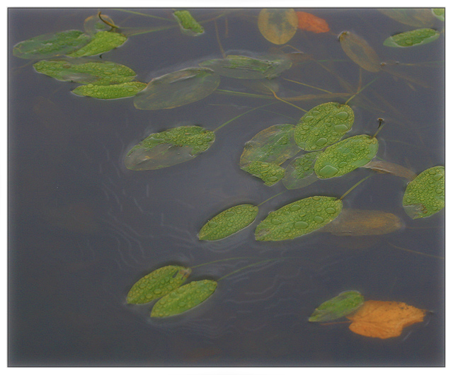
This is a really nice shot overall and the water and some of the leaves really come across with the impressionism feeling but there are more leaves that don't. It's hard to explain but the sharper looking leaves take away from the rest of the shot.
I don't know what kind of post processing you did on this shot and I guess with impressionism it's not supposed to be bright but the lack of any contrast despite the different color leaves seems off just a bit.
I'm sorry you didn't get someone who knows a little more about this type of shot but you got a lot of good critiques already.
Deannda |
|
 Photographer found comment helpful. Photographer found comment helpful. |
|
|
11/23/2004 09:10:35 PM |
|
You were robbed. Robbed, I tell ya! Looks like you were punished for lack of obvious strokes, but this is a perfectly valid example of photographic impressionism to me. It really was one of the best shots in this group. |
|
| Photographer found comment helpful. |
|
|
11/22/2004 12:32:12 AM |
|
This was just lovely. Congratulations on your 20th finish. A great wall hanger. |
|
| Photographer found comment helpful. |
Comments Made During the Challenge  |
|
|
11/21/2004 09:20:52 PM |
|
One of the few "in focus" images that I feel makes a strong connection with impressionism, and I don't know exactly why. Of course, the subject matter is excellent, the composition and muted colors are great, and the focus is juuuuust soft enough to suggest impressionism. The pale squiggly lines under the water are annoying, but I expect to see this in the top 5... maybe a ribbon. Good luck! 9 |
|
| Photographer found comment helpful. |
|
|
11/21/2004 07:01:23 PM |
Invitational Challenge Level: Experienced
Challenge link: weak. The impressionistic theme is not very apparent here.
Image critique: it's a soothing subject with subdued colours, well shot - but lacking that vital focal point to draw in a viewer.
Out-of-challenge appeal: not much reason to come back to this really.
Score: 4 |
|
| Photographer found comment helpful. |
|
|
11/21/2004 03:18:54 PM |
|
the leaves have an amazing texture and color here. I'm interested to know what those squiggles are. Interesting photo with good composition. |
|
| Photographer found comment helpful. |
|
|
11/20/2004 03:24:03 AM |
|
This is wonderful, and I like the soft tones contrasting with the drops of water. I think it's one of the stronger entries and imagine it should perform well. |
|
| Photographer found comment helpful. |
|
|
11/19/2004 09:55:25 PM |
returning for comments:
Lovely to look at with a great background to showcase the leaves. This is one of those pleasant wall hangers. Bumping up. |
|
| Photographer found comment helpful. |
|
|
11/19/2004 08:36:30 PM |
|
This is very nice I always thought impression was less detail and You have a lot of detail A nice image very nicely presented well done |
|
| Photographer found comment helpful. |
|
|
11/19/2004 06:33:00 PM |
|
i really like the muted colors and hazy look |
|
| Photographer found comment helpful. |
|
|
11/19/2004 02:58:07 PM |
|
Very pretty.. I love the droplets on the leaves. |
|
| Photographer found comment helpful. |
|
|
11/19/2004 11:26:10 AM |
|
Technically good, but the subject doesn't appeal to me. I guess the main problem is the murky looking water. The water drops on the leaves are very nice though. |
|
| Photographer found comment helpful. |
|
|
11/19/2004 05:43:01 AM |
|
I liked the haze/blur and the edging of the ripples, but found the leaves and raindrops to be too crisp to be fully impressionistic. |
|
| Photographer found comment helpful. |
|
|
11/17/2004 02:48:31 PM |
|
Lovely soft impressionistic shot... |
|
| Photographer found comment helpful. |
|
|
11/16/2004 06:05:29 PM |
|
I like the concept- but I think my idea of impressionism is different than yours. I would rather see the entire thing with a super soft focus, to give the impression, rather than the specific details visible here. |
|
| Photographer found comment helpful. |
|
|
11/16/2004 03:27:29 PM |
|
Nice shot, not punchy enough though for an impressionistic picture |
|
| Photographer found comment helpful. |
|
|
11/16/2004 01:54:36 AM |
I am only commenting and using a place holder score during this pass.
Nice water spots on the leaves. The leaves have a pleasant color. I'm just guessing, but it looks like you used a soft filter. I really want to like this but it looks to dull to hold my interest long.
|
|
| Photographer found comment helpful. |
|
|
11/15/2004 09:29:03 PM |
|
This is beautiful. I love the croppng and composition. The muted colors work so well. Great shot. Congrats. |
|
| Photographer found comment helpful. |
|
|
11/15/2004 07:36:40 PM |
|
Peaceful, subtle with great tones and composition. |
|
| Photographer found comment helpful. |
|
|
11/15/2004 05:20:26 PM |
|
nicely captured, very pleasing. this is an image to be enjoyed and absorbed. lovely colors and aesthetics. |
|
| Photographer found comment helpful. |
|
|
11/15/2004 03:45:59 PM |
|
this is beautiful and understated. one of my highest votes. only beef, seems a little tilted right. |
|
| Photographer found comment helpful. |
|
|
11/15/2004 02:57:25 PM |
|
Good allusion (whether intended or not) to 'Waterlillies'. I am swayed due to it being my favourite painting, and luckily enough it is usually at the gallery in my home city. |
|
| Photographer found comment helpful. |
|
|
11/15/2004 11:37:14 AM |
|
Very nice final result no matter how it was achieved. Not a particularly "lasting" picture but interesting. |
|
| Photographer found comment helpful. |
|
|
11/15/2004 11:02:43 AM |
|
A little overfiltered for my taste... looks like selective use of the plastic wrap filter. I'll bet this could have been gorgeous with more subtle use of PS. 5 |
|
| Photographer found comment helpful. |
|
|
11/15/2004 11:01:03 AM |
|
Nice feel to this image. I dont see it as overly impressionistic, but I like it nonetheless. 9 |
|
| Photographer found comment helpful. |
|
|
11/15/2004 04:19:41 AM |
|
Well done, the colors work well. 9. |
|
| Photographer found comment helpful. |
|
|
11/15/2004 12:30:14 AM |
|
The colors make this fit the theme very well. Excellent. |
|
| Photographer found comment helpful. |
Theme:
Classic /
Light /
Dark
Home -
Challenges -
Community -
League -
Photos -
Cameras -
Lenses -
Learn -
Help -
Terms of Use -
Privacy -
Top ^
DPChallenge, and website content and design, Copyright © 2001-2026 Challenging Technologies, LLC.
All digital photo copyrights belong to the photographers and may not be used without permission.
Current Server Time: 10/15/2026 12:29:10 AM EDT.






 Add photograph to your favorites
 Add photographer to your favorites


