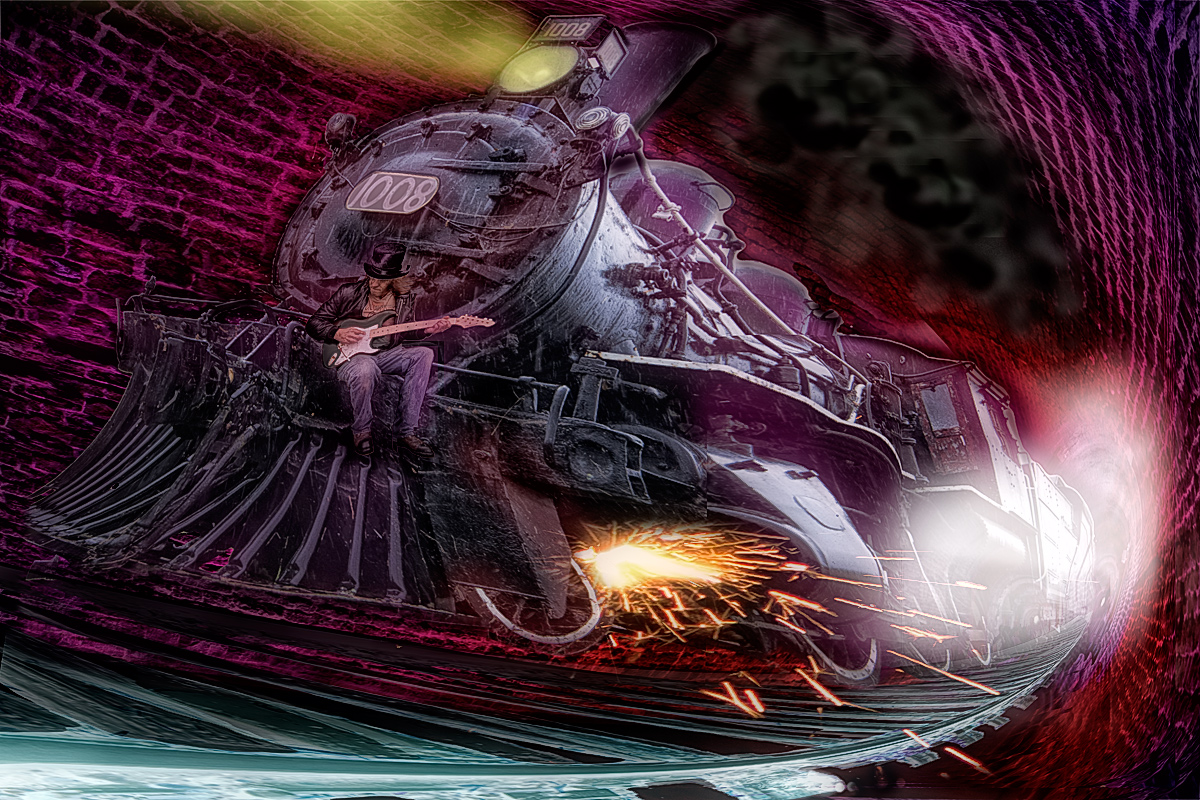
Whew, put a ton of work into this entry. First off, got my good buddy Dave to be Tom Petty. Then we drove to Morrisburg to shoot the train, then hared down the #2 to Brockville to shoot the re-opened railway tunnel, which btw is the very first railway tunnel in all of Canada. It's amazing.
Then a visit to a stretch of real railway tracks, as the floor of the railway tunnel is now paved (and flanked by coloured LEDs which provide all manner of cool effects). Miscellaneous other shoots for steam and sparks followed, then a whole trainload of PS work. Hope it pays off with at least a top 5 this time!
post-challenge - the pettiness of voters on this site never ceases to amaze me. Also, fwiw Art, I don't agree with warping and perspective putting of voters.
Had I stuck with boring ol real perspective, it wouldn't have been MY entry. It would have been an ankle-grabber entry instead.
But as usual, staying true to myself instead of moulding my work to fit other's people's expectations has only proven that I have balls enough to push the limits, and they don't.
Statistics
Place: 10 out of 38 Avg (all users): 6.1633 Avg (commenters): 8.6000 Avg (participants): 6.1579 Avg (non-participants): 6.1667 Views since voting: 895 Views during voting: 88 Votes: 49 Comments: 18 Favorites: 0
A great image that contributes to the challenge well
Well, it works for me Susan, a great image. You’ve certainly generated some interesting critique, ‘didn’t notice the guy sitting on it”…!?! For me it is always the end result that I’m interested in I’m not really interested in what or how much work has gone into it but all credit to you for the amount of effort involved. It’s original, I like the distortions, I like the sparks, most of all I like the excitement it generates with ‘Tom’ driving it all along in his own cool way. Yes, it would look great as an album cover a great tribute to a great artist, well done Susan.
For me, this was on the cusp between 4 and 5. I found the image a bit muddy. Pictures of trains generally are not that interesting to me. Trains are glorious creatures but usually aren't transformed much by a camera. Your editing work to add sparks/smoke/perspective added a point to the score. To be honest, I didn't notice the guy sitting on it. On my scale, a 3 is a meh photo that isn't doing anything interesting. So I bumped it to a 4. Much like in real life, I generally give credit for the end result, not the work put into it.
Stay true to yourself. If you want to be popular you lose yourself and will produce only more of the same stuff that gets the accolades.
I marked you 7. I mostly liked the perspective. So there! I liked what other viewers objected to. Did not have time for comments but I would have said: here is a lovely page for a Jules Verne type of book (knowing nothing of the singer).
i didn't vote, but i would have probably fallen within the boundary that you defined in your post so i thought i would take up your challenge.
i'm drawn more to the white light in the background (maybe it's smoke? if so it should be blacker so as not to distract) than i am to the train, and the image lacks sufficient depth for my tastes. it's quite flat to me. cool concept, but not executed to get a high score from me. bear in mind that any criticism or recommendations that i make by definition would have the effect of drawing the style of the photo to my own comfort zone. if this isn't your preference then i guess this advice isn't very useful. which is fine. but the image is nearly there for me! just lacking on a few details to get the final few points. the perspective really works for me too, by the way. no criticism there! mostly just the lighting and contrast for me.
btw, i could totally see this as being on the front of an awesome album cover.
"But as usual, staying true to myself instead of moulding my work to fit other's people's expectations has only proven that I have balls enough to push the limits, and they don't." stick at it!!
Congrats on the top ten. What a great effort you put into this creation. I gave you a 6. I loved the concept but something just didn't look right and I suspect it was the perspective - it just feels a wee bit messy around the front of the train especially the front wheels. However I am not saying things need to look perpsectively correct for a photo to look great - just that something about this made me take a few points off.
Great finish, Susan! My two cents on what might have kept this from scoring even higher is the skewed perspective and the waviness. If you'd have kept the train in more realistic perspective and less wavy, I think it would have jumped up at least a couple spots. I could be wrong, but would've scored higher with me. Congrats nonetheless!
Thanks Art, but I don't buy the argument. Witness the same use of unrealistic perspective in this image. Of course, if Christophe had entered this exact pic in this challenge, it would be sporting a blue ribbon and a score in the high 7s or 8s, and everyone would be wetting their panties with praise.
Great finish, Susan! My two cents on what might have kept this from scoring even higher is the skewed perspective and the waviness. If you'd have kept the train in more realistic perspective and less wavy, I think it would have jumped up at least a couple spots. I could be wrong, but would've scored higher with me. Congrats nonetheless!
An incredible image and memorial to Tom. I love how intent and peaceful he looks sitting at the head of all that power and excitement. The florid colors are handled with admirable restraint and greatly contribute to the overall intensity. A for sure ribbon winner.





 Add photograph to your favorites
 Add photographer to your favorites

 Photographer found comment helpful.