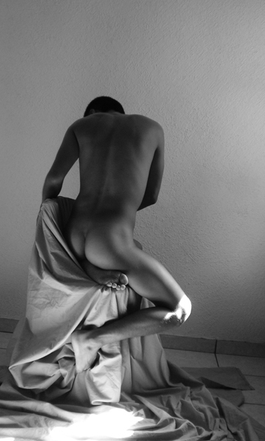
nice photo, although the light on the knee, the light fall on the floor and the flooring under the drape (tile) all take away from the beauty of the image.
Cast the light just right to avoid the knee (distracting), remove the objects at the right background and this shot is a solid 10 imo. Awesome balance of negative space also imo. If this is self portrature you are to be complimented on an excellent pose under the timer. The subject himself needs no further compliments. Beautiful. 8. Bumped to 9. What can I say. I just love the form :) Good luck!
I like the shades of shadow on his body; they really show the curves and muscles well. The highlight on the right knee is a tiny bit distracting, but I really like the shot overall.
Excellent capture of form. Nice, smooth tonality. I think improvemnt might be made with the composition. The line where the wall meets the floor seems and the grout lines seem to throw the whole thing off slightly. I like the overexposure in the lower foreground. 8
hmm and I didn't think the male body could be made to look atractive. Great shot. I like every thing about this shot except the lighting. I don't like the bright light on the models knee or on the ground. Other than those 2 spots the lighting is pretty good. keep up the ggod work.
A nice attempt with nude portraiture. Lighting is the weak point here, I believe. Too much of your model is in shadow, and the knee, being blown out, is far too distracting. I'd have loved to have seen much more detail and light on the form of the body. As it is, I'm just left wanting.
the tonality of the body is nice but what ruins it for me is the tilted camera angle which is really evident where the floor meets the wall. Also the harsh highlight in the bottom center is distracting
I like it but I think it would have been improved if the cloth had covered all of the tiles on the floor and the skirting board, as they leave this with the person looking very professional but the floor making it look a lot less so.
Interesting study. Two criticisms - firstly, I feel that it would have been stronger had the horizon be level. Secondly, I feel that the blown highlights are distracting and really needed to be avoided in this kind of shot.
excellent. what a shame about the knee i feel the light is too strong there it may be my monitor but the floor and knee seem over exposed .. still worth a 6 from me






 Add photograph to your favorites
 Add photographer to your favorites

 Photographer found comment helpful.


