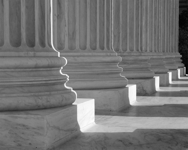
Well executed example of how to make the most of light and shade.
I never voted in this challenge but I certainly would have rated this highly.
Well done.
returning for comments:
Nothing like light and marble. great b/w and oh so good to incorporate the often overlooked strength of the shadows. Bumping up.
Super! I really like this. However, I think it would be even better with a crop at the top. That would put the diminishing part (via perspective) of the round part of the base into the diagonal of the shot (mostly). I am suggesting about cutting more than 1/2 of the vertical striped area of the columns in the crop: try it and perhaps you'll see what I mean.






 Add photograph to your favorites
 Add photographer to your favorites


 Photographer found comment helpful.


