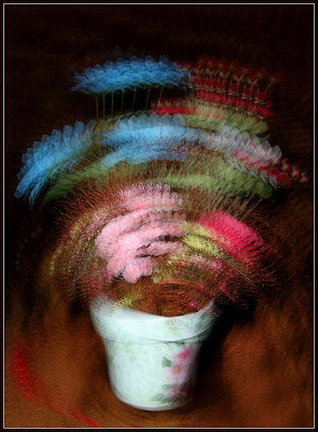
Used the strobe function on my 550EX flash. I set it to fire off approximately 7 flahes in 1/6 of a second. I set the floral arrangement on a brown velvet chair in my parents' basement. No special filters, just sharpen a little bit.
Statistics
Place: 27 out of 39 Avg (all users): 6.0500 Avg (commenters): 7.5556 Avg (participants): 6.3438 Avg (non-participants): 6.0195 Views since voting: 1485 Views during voting: 651 Votes: 340 Comments: 35 Favorites: 2 (view)
Good color, and a very creative approach, but I'm not entirely sold on this look as impressionism. I think it's because of all the sharp little details visible with each flash. This might sound weird, but on my screen it looks like cropping down to only the bottom right corner (just the pot and background) would be a better representation of the soft style of impressionism I envision.
Image critique: well it's impressionism - but dizzying! Whether the subject is appropriate? I don't hink so - it seems that anything would do just to use this technique, so therefore it's gratuitous without much purpose. Strong colour, crop is a bit tight at the bottom.
Out-of-challenge appeal: yeah - I quite like this.
This one eludes me. If the lens is tripod mounted, the camera body could rotate on a slight zoom, but there seems to be no zoom effect. If the body were tripod mounted, the center rotation would move and not stay centered. The plant doesn't look like it's spring loaded...how'd you do this one? I liked it very much but the red swatch streak in the left corner seemed way out of place.
I like the effect here. It is interesting to add motion to what would normally be a still life.It works for me. I'll be interested in reading how you created the effect. nice job!
Good choice of subject and very neat effect. At first it looked like ordinar motion blur, but I see it really does have a strobe effect here, so it must have been done differently.
The rotation is a bit too much for me. It gives a decent painted effect, but almost makes me feel dizzy!
It is growing on me though. Gonna bump it up from my initial ranking.
Very cool effect. It looks like you used motion blur to create a paint brush feeling. Very well done. I like your creativeness and attempt at trying something different.
Although this is my choice for the yellow ribbon, I wonder what it would look like if the flower pot and flowers hadn't been moved. I don't know if that makes sense :P
Very interesting and lovely work. The staggered multiple image works for me by and large. It's perfect for the cubism challenge! Colors and composition are effective and very formal. So . . . nice. 8





 Add photograph to your favorites
 Add photographer to your favorites

 Photographer found comment helpful.


