Critique Club Critique Compostition/Content Great composition. I really like the way you arranged the manequins stacked up in the corner. Great use of props: hats, pillow and material. Really meets the challenge well.
Lighting Absolutely fantastic lighting. I would like to know how you set up the lighting. The shadows on all of the figures really define the shapes yet none of the shadows are too dark. I also like the light areas behind the hat on the left and behind the two heads on the right. The lighting made this shot.
Camera Work/Technical Good exposure and focus. Nice camera angle.
Post Processing It's difficult to tell what caused the grain in the image. I like the way the grain and the sepia give the image an old look. It is a strange looking grain when I zoom in on the image. I don't know what caused it. I tried highest compression and lowest quality and still couldn't get the grain in my image to look like yours, so I don't think it was the compression.
My Opinion I wouldn't want to see the image without any grain because it adds to the look of the image, but I would like to see what it would look like with maybe half the grain that it has now. Really great setup and execution. I ran your image through NeatImage and is really cleaned up the grain, you might try it.
This is the one I wanted to do but none of the shops around here had any manequins!! I am also surprised that you are the only person who did this. And you did it well too, you met the challlenge for sure. I see some artifacts here, coming from saving for the web at a too low a setting. Oh yes and I spotted Waldo in your photo :-)
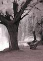
Nice work - black and white is essential in hiding the person here I believe. Focus and composition are good, although the image does feel slightly lop-sided - too much on the right but not enough to appear deliberate.







 Add photograph to your favorites
 Add photographer to your favorites


