What! Just her head?
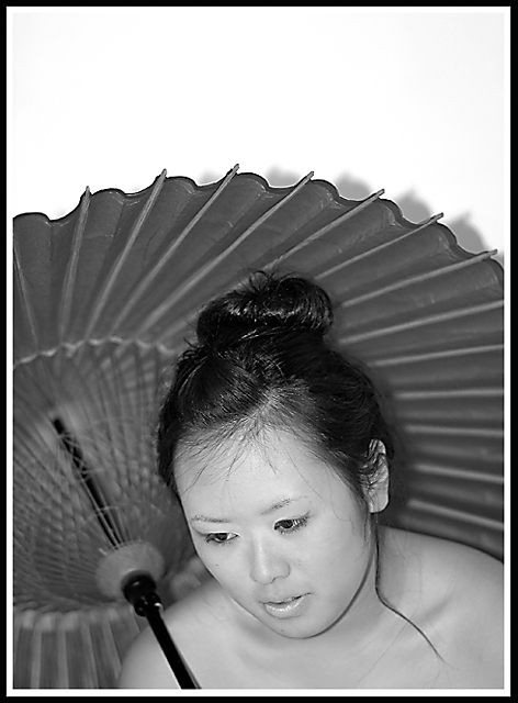
Way too much space above her, cropping the bottom half or so of the image would improve it a bit, but as it is, especially with her looking down away from the camera, she doesn't hold my attention. The umbrella is more of a focal point.
You're going to get a few comments about the shadow on the wall ... oh, I guess this is one of them. I bet the umbrella was red ... they're always red, it seems.
The white at the top seems distracting to my eyes, drawing me away from the rest of the photo, perhaps crop tighter to make the umbrella lead the focus to her?
Like the shot........but all the white at the top keeps drawing my eyes away from the subject. Maybe crop most of it out? Or a dark background would maybe make the subject stand out more?
The lighting is a bit harsh since her shadow is on the back of the umbrella and the composition could have been better, the negative space at the top doesn´t do anything for me. Anyway, not bad, as a matter of fact better than most shots in the challenge, keep it up.






 Add photograph to your favorites
 Add photographer to your favorites


 Photographer found comment helpful.


